Mountain Weather UK goes live!

AppIcon1024-512It’s been 12 months in the making and over the last 4 months I haven’t even had time to post on this blog because all my spare time has been devoted to finishing and finally publishing my mountain weather app. Well, finally I am excited to announce the release of Mountain Weather UK, the first and only mobile phone app dedicated to mountain weather in the UK.

Simulator Screen Shot 24 Oct 2015 11.23.42_iphone6_gold_side2The App is entirely written in Xamarin Forms using all the things I have blogged about so far. There have been quite a lot of design changes which I have made over the last 4 months to get the app to where it is now and I am very pleased with the results. I have kept the design very clean and simple and taken much inspiration from Material Design. Here are some of the features in the App.

Mountain Area Forecasts

5-day forecasts for all UK mountain regions providing daily forecast summaries, freezing levels, high and low level temperatures, wind speed and directions, visibility, hill fog and mountain hazards.

Mountain Summit Forecasts

5-day forecasts for all major mountain summits in the UK with 3 hourly forecasts covering weather type, temperature, wind speeds, gusts and direction, visibility, precipitation probability, humidity and UV. Easily find mountain summits using the search feature, including regional maps of all major summits.

Weather Station Observations

24-hour observation data for all weather stations in each mountain area, including, Temperature, Wind Speed, Wind Direction and Humidity, including regional maps of all observation stations.

Weather Forecast Maps

36-hour weather forecast Maps including precipitation, cloud, temperature and surface pressure and synoptic pressure charts.

Recent

Recent weather forecasts and weather station observations for quick access to all your favourite weather forecast and observational locations.

Nearest Locations

Nearest geographical area and mountain forecasts from your current location. Automatically updated depending on your location.

I hope to be sharing with you over my next few posts some of the things I have learnt and experienced over the last 4 months to get this app to the app stores. It’s been quite some journey!

Download now on iPhone from the Apple App Store or on Android from Google Play or visit the website at www.mountainweatheruk.com.

Adding a Bindable Map with the Map Behavior

IMG_1288_iphone6plus_gold_portraitMy weather app provides weather forecasts for all mountains in each mountain area in the UK. I display a list of mountain summits from which you can select to get a 5 day forecast. I have also added a search bar to make it easy to search for a specific mountain in the list. This is all fine but the list is a little dull. It would be great if I could see all these mountains on a map and use the search bar to filter and zoom into a specific mountain.

Xamarin Forms provides a cross platform map control out of the box, well almost. You need to add Xamarin.Forms.Maps via NuGet to your project and follow the setup in the guide here. This is a great control but one thing it doesn’t provide is the ability to bind to a list of locations. So I wrote this Map Behavior which provides an ItemsSource property so you can bind to a list of locations.

    public class MapBehavior : BindableBehavior<Map>
    {
        public static readonly BindableProperty ItemsSourceProperty = BindableProperty.Create<MapBehavior, IEnumerable<ILocationViewModel>>(
            p => p.ItemsSource, null, BindingMode.Default, null, ItemsSourceChanged);

        public IEnumerable<ILocationViewModel> ItemsSource
        {
            get { return (IEnumerable<ILocationViewModel>)GetValue(ItemsSourceProperty); }
            set { SetValue(ItemsSourceProperty, value); }
        }

        private static void ItemsSourceChanged(BindableObject bindable, IEnumerable oldValue, IEnumerable newValue)
        {
            var behavior = bindable as MapBehavior;
            if (behavior == null) return;
            behavior.AddPins();
        }

        private void AddPins()
        {
            var map = AssociatedObject;
            for (int i = map.Pins.Count-1; i >= 0; i--)
            {
                map.Pins[i].Clicked -= PinOnClicked;
                map.Pins.RemoveAt(i);
            }

            var pins = ItemsSource.Select(x =>
            {
                var pin = new Pin
                {
                    Type = PinType.SearchResult,
                    Position = new Position(x.Latitude, x.Longitude),
                    Label = x.Title,
                    Address = x.Description,

                };

                pin.Clicked += PinOnClicked;
                return pin;
            }).ToArray();

            foreach (var pin in pins)
                map.Pins.Add(pin);

            PositionMap();
        }

        private void PinOnClicked(object sender, EventArgs eventArgs)
        {
            var pin = sender as Pin;
            if (pin == null) return;
            var viewModel = ItemsSource.FirstOrDefault(x => x.Title == pin.Label);
            if (viewModel == null) return;
            viewModel.Command.Execute(null);
        }

        private void PositionMap()
        {
            if (ItemsSource == null || !ItemsSource.Any()) return;

            var centerPosition = new Position(ItemsSource.Average(x => x.Latitude), ItemsSource.Average(x => x.Longitude));

            var minLongitude = ItemsSource.Min(x => x.Longitude);
            var minLatitude = ItemsSource.Min(x => x.Latitude);

            var maxLongitude = ItemsSource.Max(x => x.Longitude);
            var maxLatitude = ItemsSource.Max(x => x.Latitude);

            var distance = MapHelper.CalculateDistance(minLatitude, minLongitude,
                maxLatitude, maxLongitude, 'M') / 2;

            AssociatedObject.MoveToRegion(MapSpan.FromCenterAndRadius(centerPosition, Distance.FromMiles(distance)));

            Device.StartTimer(TimeSpan.FromMilliseconds(500), () =>
            {
                AssociatedObject.MoveToRegion(MapSpan.FromCenterAndRadius(centerPosition, Distance.FromMiles(distance)));
                return false;
            });
        }
    }

The first thing to note here is that this behavior inherites from BindableBehavior<T>, which I created because the Behavior class does not set it’s BindingContext when attached to a visual element and therefore any BindableProperties do not get updated. I blogged about this previously here. BindableBehavior sets the BindingContext on the Behavior when it is attached to the visual element and also introduces a property called AssociatedOject which is the visual element the behavior is attached to, which is very similar to how behaviors work in WPF. Here’s the code for BindableBehavior.

    public class BindableBehavior<T> : Behavior<T> where T : BindableObject
    {
        public T AssociatedObject { get; private set; }

        protected override void OnAttachedTo(T visualElement)
        {
            base.OnAttachedTo(visualElement);

            AssociatedObject = visualElement;

            if (visualElement.BindingContext != null)
                BindingContext = visualElement.BindingContext;

            visualElement.BindingContextChanged += OnBindingContextChanged;
        }

        private void OnBindingContextChanged(object sender, EventArgs e)
        {
            OnBindingContextChanged();
        }

        protected override void OnDetachingFrom(T view)
        {
            view.BindingContextChanged -= OnBindingContextChanged;
        }

        protected override void OnBindingContextChanged()
        {
            base.OnBindingContextChanged();
            BindingContext = AssociatedObject.BindingContext;
        }
    }

The MapBehavior exposes an ItemsSource BindableProperty of type IEnumerable<ILocationViewModel>. ILocationViewModel looks like this.

    public interface ILocationViewModel
    {
        string Title { get; set; }
        string Description { get; }
        double Latitude { get; }
        double Longitude { get; }
        ICommand Command { get; }
    }

This is the basic information you need to support a location on a map. You need to provide a ViewModel that implements this and a ViewModel that exposes a list of LocationViewModels. The AddPins method is called whenever the ItemsSource property changes. The AddPins method first removes any pins which may already exist and unsubscribes the Click Event. Then it creates a Pin for each Location, hooks up the Click event and adds these to the map Pins. The Click event just executes the Command on the LocationViewModel. I then position the map so that it is correctly positioned to where the pins are located. I do this by finding the centre position using the average latitude and longitude and the radius by calculating the max and min latitude and longitude and using the following MapHelper, which I found here, to Calculate the current distance.

    public static class MapHelper
    {
        public static double CalculateDistance(double lat1, double lon1, double lat2, double lon2, char unit)
        {
            double theta = lon1 - lon2;
            double dist = Math.Sin(Deg2Rad(lat1)) * Math.Sin(Deg2Rad(lat2)) + Math.Cos(Deg2Rad(lat1)) * Math.Cos(Deg2Rad(lat2)) * Math.Cos(Deg2Rad(theta));
            dist = Math.Acos(dist);
            dist = Rad2Deg(dist);
            dist = dist * 60 * 1.1515;
            if (unit == 'K')
            {
                dist = dist * 1.609344;
            }
            else if (unit == 'N')
            {
                dist = dist * 0.8684;
            }
            return (dist);
        }

        private static double Deg2Rad(double deg)
        {
            return (deg * Math.PI / 180.0);
        }

        private static double Rad2Deg(double rad)
        {
            return (rad / Math.PI * 180.0);
        }
    }

I then call the Maps MoveToRegion method using MapSpan.FromCenterAndRadius. Also notice that I call this again using a Timer. This fixes a strange bug where the map didn’t set the position when changing the visibility of the map to true. I do this in my view to switch between the List and the Map. Let’s take a look at the Xaml for the Map.

      <maps:Map MapType="Street" VerticalOptions="FillAndExpand" IsVisible="{Binding ShowMap}">
        <maps:Map.Behaviors>
          <behaviors:MapBehavior ItemsSource="{Binding Items}" />
        </maps:Map.Behaviors>
      </maps:Map>

Notice I am binding the ItemsSource to the Items property of my ViewModel and I am also binding the Maps IsVisible property to a ShowMap property on my ViewModel. I have a ToolbarItem which toggles this property so that I can switch between the list and the map. Here’s the full Xaml for my page which allows switching between the list and the map.

<?xml version="1.0" encoding="utf-8" ?>
<ContentPage xmlns="http://xamarin.com/schemas/2014/forms"
             xmlns:x="http://schemas.microsoft.com/winfx/2009/xaml"
             xmlns:coreBehaviors="clr-namespace:Silkweb.Mobile.Core.Behaviors;assembly=Silkweb.Mobile.Core"
             xmlns:views="clr-namespace:Silkweb.Mobile.Core.Views;assembly=Silkweb.Mobile.Core"
             x:Class="Silkweb.Mobile.MountainWeather.Views.SitesView"
             xmlns:d="http://schemas.microsoft.com/expression/blend/2008"
             xmlns:mc="http://schemas.openxmlformats.org/markup-compatibility/2006"
             xmlns:coreViewModels="clr-namespace:Silkweb.Mobile.Core.ViewModels;assembly=Silkweb.Mobile.Core"
             xmlns:maps="clr-namespace:Xamarin.Forms.Maps;assembly=Xamarin.Forms.Maps"
             xmlns:behaviors="clr-namespace:Silkweb.Mobile.MountainWeather.Behaviors;assembly=Silkweb.Mobile.MountainWeather"
             xmlns:viewModels="clr-namespace:Silkweb.Mobile.MountainWeather.ViewModels;assembly=Silkweb.Mobile.MountainWeather"
             xmlns:converters="clr-namespace:Silkweb.Mobile.Core.Converters;assembly=Silkweb.Mobile.Core"
             xmlns:generic="clr-namespace:System.Collections.Generic;assembly=System.Runtime"
             mc:Ignorable="d" Title="{Binding Title}"
             d:DataContext="{d:DesignInstance Type=viewModels:SitesViewModel, IsDesignTimeCreatable=False}">

  <ContentPage.Resources>
    <ResourceDictionary>
      <converters:BooleanToObjectConverter x:Key="booleanToObjectConverter">
        <converters:BooleanToObjectConverter.TrueValue>
          <FileImageSource File="List.png" />
        </converters:BooleanToObjectConverter.TrueValue>
        <converters:BooleanToObjectConverter.FalseValue>
          <FileImageSource File="Map.png" />
        </converters:BooleanToObjectConverter.FalseValue>
      </converters:BooleanToObjectConverter>
    </ResourceDictionary>
  </ContentPage.Resources>

  <ContentPage.ToolbarItems>
    <ToolbarItem Icon="{Binding ShowMap, Converter={ StaticResource booleanToObjectConverter}}" Command="{Binding ShowMapCommand}" />
  </ContentPage.ToolbarItems>

  <StackLayout>

    <SearchBar Text="{Binding SearchText}" SearchCommand="{Binding SearchCommand}" TextChanged="SearchBar_OnTextChanged" />

    <Grid VerticalOptions="FillAndExpand">

      <maps:Map MapType="Street" VerticalOptions="FillAndExpand" IsVisible="{Binding ShowMap}">
        <maps:Map.Behaviors>
          <behaviors:MapBehavior ItemsSource="{Binding Items}" />
        </maps:Map.Behaviors>
      </maps:Map>

      <TableView Intent="Menu" IsVisible="{Binding ShowMap, Converter={StaticResource negateConverter}}">
        <TableView.Behaviors>
          <coreBehaviors:TableViewItemsSourceBehavior ItemsSource="{Binding Groups}">
            <coreBehaviors:TableViewItemsSourceBehavior.ItemTemplate>
              <DataTemplate>
                <views:TextCellExtended Text="{Binding Title}" ShowDisclosure="True" Command="{Binding Command}" CommandParameter="{Binding Item}"
                                        d:DataContext="{d:DesignInstance Type=coreViewModels:ItemViewModel}"/>
              </DataTemplate>
            </coreBehaviors:TableViewItemsSourceBehavior.ItemTemplate>
          </coreBehaviors:TableViewItemsSourceBehavior>
        </TableView.Behaviors>
      </TableView>

    </Grid>

  </StackLayout>
</ContentPage>

The ToolbarItem uses a BooleanToObjectConverter to toggle the Icon between a list and a map depending on the ShowMap Boolean property. Here’s the converter.

    public class BooleanToObjectConverter : IValueConverter
    {
        public object TrueValue { get; set; }

        public object FalseValue { get; set; }

        public object Convert(object value, Type targetType, object parameter, CultureInfo culture)
        {
            if (!(value is bool)) return null;

            var boolValue = (bool) value;

            return boolValue ? TrueValue : FalseValue;
        }

        public object ConvertBack(object value, Type targetType, object parameter, CultureInfo culture)
        {
            var stringValue = value as string;
            if (stringValue == null) return false;

            return stringValue.Equals(TrueValue);
        }
    }

The ToolbarItem calls the ShowMapCommand which simply toggles the ShowMap property on the ViewModel. The list is a TableView which groups the locations alphabetically using the TableViewItemsSourceBehavior I discussed in a previous post here. The SearchBar Text property is bound to the view models SearchText property. When the Text changes it calls the SearchCommand on the ViewModel to filter the Items by the SearchText. I’ll discuss this in another post.

Let’s see how things look in action.

Looks great.

Maps really add a new dimension to your application when displaying locations like this. I hope you find this behavior useful for binding your location data to the Xamarin Forms Map control.

Web Service Resilience

Currently my Weather app is providing data from the Met Office Data Point web service and everything seems to work well, until there is no internet connectivity. For mobile applications this is a crucial aspect for web services which need to be built into our applications. It is important that we can check if we have connectivity to the internet and take steps accordingly. One thing I want to achieve is to cache any data so that it can be shown first the next time I try to connect. This gives a perceived performance improvement because data can be displayed whilst trying to connect to get updates. This all seems like it could be quite a lot of hard work to achieve with Xamarin Forms but it is actually very simple with the help of a couple of plugins.

Connectivity Plugin

This is a simple cross platform plugin to check the connection status of a mobile device and provide information about connection types, bandwidths etc. It is written by James Montemago so it is bound to be good stuff. Simply install this via NuGet from either Visual or Xamarin Studio. Make sure that you add this to both your PCL and Target platform projects. Also on Android make sure that you add permissions for ACCESS_NETWORK_STATE and ACCESS_WIFI_STATE in your project preferences.

The usage is very simple. To check if the device is connected just call

CrossConnectivity.Current.IsConnected.

This however will return true if you are connected to Wi-Fi but don’t have an internet connection, so you need to also call CrossConnectivity.Current.IsRemoteReachable passing in a valid web URL (without http or www), for example google.com. This is also asynchronous so you should await this call. Combine both these calls to correctly check for a connection like this:

public async Task<bool> IsConnected()
{
    return CrossConnectivity.Current.IsConnected &&
           await CrossConnectivity.Current.IsRemoteReachable("google.com");
}

Akavache

I also want to be able to cache any previous data and display this whilst I attempt and retrieve any updated data. Akavache, written by Paul Betts, provides an excellent data persistence library based on SQLLite3. Matthew Soucoup provides us with a great article on Akavache here. Also checkout this post here on installing Akavache as you may have to update some packages for Windows Phone projects.

What’s really great is the ability to return cached data, if there is any, and then go and fetch data from a web service and store that as the cached data for next time. You would think this would take quite a lot of work to achieve, but Paul has utilised some Rx (Reactive Extensions) goodness and provided a method named GetAndFetchLatest, which we can subscribe to get an observable stream of both the cached data and the updated data.

Combine this will Cross Connectivity and we can provide a resilient web service call that will return any cached data first, if there is any, check for an internet connection then go a fetch data if we are connected and return that as well as caching it for next time. If there is no connection then simply return and just display the cached data.

public IObservable<ForecastReport> GetAreaForecast(int id)
{
    return BlobCache.LocalMachine.GetAndFetchLatest("AreaForecast" + id,
        async () =>
        {
            if (!await IsConnected()) return null;
            return await GetAreaForecastAsync(id);
        }, null, null);
}

And then we can subscribe to the observable like this and update our view model as we receive them.

IsBusy = true;
service.GetAreaForecast(id)
    .Subscribe(result => InitialiseForecast(result), HandleError,
        () => IsBusy = false);

All very clever stuff I’m sure you’ll agree.

There are a number of other great libraries out there for Xamarin Forms to help with network resilience. It’s worth checking out the excellent ‘Resilient network services with mobile Xamarin apps’ by Rob Gibbens for more details.

Material Designer for Xamarin Forms

appscreenshot_iphone6_gold_side2 copy

There’s been a lot of talk recently about Material Design. You can find some really nice inspiring designs at materialup and dribbble. I wasn’t entirely happy with my Area Weather Forecast page design, so I wanted to experiment with the design and take some ideas and inspiration from these great designs.

I could try doing this in a design tool like Photoshop but, as a developer, I find this quite tedious and find myself wasting a lot of time wrestling with it and then have to reproduce it in Xaml. Wouldn’t it be nice if there was a real Xaml design editor for Xamarin Forms just like we have in WPF and Windows Phone? I’m sure Xamarin have this on their ‘to do’ list somewhere.

I’m not always a fan of using the designer however. It isn’t always necessary some of the time, especially if you’re just displaying a list of items or something similar. But sometimes it really does help for more complex layouts where you want to be able to experiment and tweak things. There’s nothing worse than having to continuously make changes and then run up the app every time. I find this such a waste of time.

I wondered whether it would actually be possible to use the Windows Phone designer and somehow convert the Xaml to Xamarin Forms Xaml. The Xaml is very similar so surely all that’s needed is some sort of conversion tool. I did a quick search and to my delight I discovered one already exists.

Pete Vickers of GUI Innovations has done just that here. The same thought obviously occurred to him and he’s written this wonderful conversion tool to convert Windows Phone Xaml to Xamarin Forms Xaml. This got me very excited, so I set about coming up with a workflow that would allow me to visually create and modify my designs in Xaml using the Windows Phone Xaml designer and then convert and use this in my own Xamarin Forms App.

Screen Shot 2015-05-18 at 21.20.04

The conversion tool converts things like TextBlock to Label, TextBox to Entry, StackPanel to StackLayout etc, as well as converting properties like Margin to Padding and HorizontalAlignment to HorizontalOptions, with options for how you want to convert the alignments. There is also a settings screen that allows you to extend what the tool can convert, ignore and remove. This I found very useful as I’ll discuss shortly.

Screen Shot 2015-05-18 at 21.20.17

(Just a slight rant here; I really wish there was some kind of Xaml body to govern the standards for Xaml in the same way that the W3C does for web standards. Why oh why do we have all these inconsistencies. First it was WPF v Silverlight, then there was Windows Phone, followed by Windows RT and then Windows Universal Apps, and now we have another version of Xaml for Xamarin Forms. All of which have different names for the same control with differing properties and standards. This I feel really sucks. If Xaml were better managed and standardised like HTML we wouldn’t have to resort to having to convert from one to the other. Rant over.)

The first thing you will need is a Windows Phone project running in Visual Studio. If you have set up your Xamarin Forms solution to include Windows Phone then you can just use the existing Windows Phone project in your solution. What I did was created a folder called ‘Views’ and creating a new Windows Phone page from the new items templates and called it Prototype. You should then see the Designer alongside the Xaml like this.

Screen Shot 2015-05-18 at 21.25.13

Then you can set about designing your page using either the designer or the Xaml directly. I find editing the xaml directly is far easier and quicker. The best approach is to stick to the basic controls which you know will convert well. Sticking to Grid and StackPanel for the layout works well and TextBlock and Image work good for content. It’s best just to create something very simple first and then run it through the converter to see how it looks.

Open the converter and choose your Windows Phone xaml page you’ve just created by clicking the ellipse. The tool will then automatically suggest a name for the converted file in the same location. You can change this if you like but I just kept it the same as I’m just going to copy the converted xaml and paste it in my Xamarin Forms project. Then click ‘Generate’ to convert the Xaml to Xamarin Forms. You might also want to experiment a bit with the settings to see which works out best for you. I ended up adding a bunch of extra stuff to the replace list and deleted most of the stuff from the remove list. For example I didn’t want it to remove DataContext as I wanted to define some bindings in the Xaml so I deleted this from the remove list and added a replace for DataContext to BindingContext to the replace list. I also removed Height and Width from the remove list and added Height,HeightRequest and Width,WidthRequest to the replace list. Here are my modified settings.

  • Rectangle,BoxView;
  • HorizontalTextAlignment,XAlign;
  • Height,HeightRequest;
  • Width,WidthRequest;
  • RowDefinition HeightRequest,RowDefinition Height;
  • ColumnDefinition WidthRequest,ColumnDefinition Width;
  • DataContext,BindingContext;
  • ItemsControl,views:ItemsView;

Notice the last modification that converts an ItemsControl to my custom ItemsView, complete with the namespace prefix of views. I also had to convert Row/Column Definition Height/WidthRequest back to Height/Width as the converter converts them to Height/WidthRequest and in the case of Row/Column Definitions the correct properties are actually Height/Width.

Note: I discovered there appears to be a bug where anything you add to the remove list does not seem to get saved. I tracked down the location of the file where it gets saved to in

‘C:\Program Files (x86)\GUI Innovations Limited\Windows Phone Forms to Xamarin Forms\WP to XF.exe.config’

for the default settings, and custom user settings get saved in user.config, which I is located in

‘users\[username]\AppData\Local\ GUI_Innovations_Limited\…’

The trick here is to add a section for the Remove List to this file, because there won’t be one, which you can copy from ‘WP to XF.exe.config’. Then add in your entries in the format similar to ‘TextBox,Entry’. I’ve mentioned this issue to Pete so hopefully this will be fixed soon. It’s also worth pointing out that this is a beta product at the moment and any feedback from users will greatly help its development.

Once you have got the converted Xaml, copy this to your Xamarin Forms page. What I did was create a new page called Prototype that I set as the MainPage of my Xamarin Forms Application so that I can test out the results without running up the rest of my app in full. This allows me to quickly run up my prototype design before I incorporate it into the pages within my application.

One thing to bear in mind is the variations in font sizes and the way in which widths and heights are interpreted on different platforms. This is particularly evident between Windows Phone and iOS/Android. And since we are designing everything using the Windows Phone designer we definitely need to cater for this. We can do this using Styles, which are supported by both WP and XF Xaml. The trick here is to place anything that might vary within a style.

I didn’t want to clutter my Xaml page with Styles so I placed all these in the App.xaml of the Windows Phone project. I would have preferred to place them in a completely separate xaml file but there doesn’t seem to be a way to merge this with the application styles like you can with WPF (more to investigate here). You then need the equivalent styles in your Xamarin Forms project with the exact same keys, which you should place in the App.xaml file of your XF project.

You can initially use the conversion tool to convert the styles from WP to XF, so that things like Margin become Padding and TargetTypes like StackPanel become StackLayout. However, you will need to add in variations for the various platforms using OnPlatform for anything that will vary. What I did was initially set up Styles for the various Xamarin Forms Named Font Sizes of Default, Micro, Small, Medium and Large. These vary across platforms and you can’t use these directly within the WP Xaml so you will need a Style to represent them if you intend to use them. Here’s an example of the Styles I created for these for both WP and XF.

WP Styles:

<Style x:Key="textStyle" TargetType="TextBlock">
    <Setter Property="FontFamily" Value="Segoe WP Light" />
    <Setter Property="Foreground" Value="White" />
    <Setter Property="FontSize" Value="20" />
    <Setter Property="TextWrapping" Value="Wrap"/>
</Style>
<Style TargetType="TextBlock" BasedOn="{StaticResource textStyle}"/>

<Style x:Key="microTextStyle" TargetType="TextBlock" BasedOn="{StaticResource textStyle}">
    <Setter Property="FontSize" Value="16" />
</Style>
<Style x:Key="smallTextStyle" TargetType="TextBlock" BasedOn="{StaticResource textStyle}">
    <Setter Property="FontSize" Value="19" />
</Style>

<Style x:Key="mediumTextStyle" TargetType="TextBlock" BasedOn="{StaticResource textStyle}">
    <Setter Property="FontSize" Value="22" />
</Style>

<Style x:Key="largeTextStyle" TargetType="TextBlock" BasedOn="{StaticResource textStyle}">
    <Setter Property="FontSize" Value="32" />
</Style>
<Style x:Key="largeTextStyle1" TargetType="TextBlock" BasedOn="{StaticResource textStyle}">
    <Setter Property="FontSize" Value="48" />
</Style>
<Style x:Key="largeTextStyle2" TargetType="TextBlock" BasedOn="{StaticResource textStyle}">
    <Setter Property="FontSize" Value="56" />
</Style>
<Style x:Key="largeTextStyle3" TargetType="TextBlock" BasedOn="{StaticResource textStyle}">
    <Setter Property="FontSize" Value="100" />
</Style>

And here are the equivalent styles for Xamarin Forms with the named style names:

<Style x:Key="textStyle" TargetType="Label">
  <Setter Property="FontFamily" Value="SegoeWP-Light" />
  <Setter Property="TextColor" Value="White" />
  <Setter Property="FontSize" Value="Default" />
</Style>
<Style TargetType="Label" BasedOn="{StaticResource textStyle}" />

<Style x:Key="microTextStyle" TargetType="Label" BasedOn="{StaticResource textStyle}">
  <Setter Property="FontSize" Value="Micro" />
</Style>

<Style x:Key="smallTextStyle" TargetType="Label" BasedOn="{StaticResource textStyle}">
  <Setter Property="FontSize" Value="Small" />
</Style>

<Style x:Key="mediumTextStyle" TargetType="Label" BasedOn="{StaticResource textStyle}">
  <Setter Property="FontSize" Value="Medium" />
</Style>

<Style x:Key="largeTextStyle" TargetType="Label" BasedOn="{StaticResource textStyle}">
  <Setter Property="FontSize" Value="Large" />
</Style>
<Style x:Key="largeTextStyle1" TargetType="Label" BasedOn="{StaticResource textStyle}">
  <Setter Property="FontSize">
    <Setter.Value>
      <OnPlatform x:TypeArguments="x:Double" iOS="36" Android="36" WinPhone="48" />
    </Setter.Value>
  </Setter>
</Style>

<Style x:Key="largeTextStyle2" TargetType="Label" BasedOn="{StaticResource textStyle}">
  <Setter Property="FontSize">
    <Setter.Value>
      <OnPlatform x:TypeArguments="x:Double" iOS="42" Android="42" WinPhone="56" />
    </Setter.Value>
  </Setter>
</Style>

<Style x:Key="largeTextStyle3" TargetType="Label" BasedOn="{StaticResource textStyle}">
  <Setter Property="FontSize">
    <Setter.Value>
      <OnPlatform x:TypeArguments="x:Double" iOS="75" Android="75" WinPhone="100" />
    </Setter.Value>
  </Setter>
</Style>

Notice I have created 3 additional large text styles and defined their platform variations using OnPlatform.

There’s a little bit of work involved to define the styles initially, and you will probably end up maintaining these manually rather than using the conversion tool, but I think its good practice to place anything that varies in a separate Style. Your Xaml then becomes less tied to fixed sizes which make it more flexible. You also need to bear in mind that any Sizes for Heights, Widths or Margins will need to be roughly about 25% less on iOS and Android. If for example you define a Grid with a Height and Width of 100, it might look ok in the WP designer, but it will look much larger when you run it on the other platforms. Again factoring these out into Styles means that you catch these layout variations early and provide OnPlatform variations in a Style. This means your design is more likely to work against all platforms. Here’s a good example of a Style I created for variations in sizes for my page.

WP style

<Style x:Key="periodOuterStyle" TargetType="Grid">
    <Setter Property="Margin" Value="1" />
    <Setter Property="Width" Value="120" />
</Style>

Equivalent XF Style using OnPlatform:

<Style x:Key="periodOuterStyle" TargetType="Grid" BasedOn="{StaticResource gridStyle}">
  <Setter Property="Padding" Value="1" />
  <Setter Property ="WidthRequest">
    <Setter.Value>
      <OnPlatform x:TypeArguments="x:Double" iOS="90" Android="90" WinPhone="120" />
    </Setter.Value>
  </Setter>
</Style>

This means that your xaml shouldn’t actually have any hard coded font sizes or heights, instead referencing styles. It should just define the layout and content. This in many ways is similar to the approach used for Web pages using CSS.

Finally, my Piece De Resistance!

In WPF/WP it is possible to create design data which you can use to get a better visual representation in the designer of the data you will be working with. It also allows you to correctly define all the data bindings which will hook up to the view model of the page. I really wanted my converted Xaml to come compete with all these bindings and to be able to visually see what the result was in the actual designer. Design Data can be defined in your Xaml using the d:DataContext declaration. With this you can either define some design data as an xml file, or you can specify the actual type that the designer will create at design-time and populate with data. I was curious if it would be possible to use my existing Weather Service which my View Model requires as an injected parameter. I guess dependency injection is too much to ask really, but all I needed to do was to create a SampleData class that derives from my ViewModel with a parameterless constructor that creates my Weather Service and passes it to the base constructor like this:

    public class SampleData : AreaForecastReportViewModel
    {
        public SampleData() : base(new MountainWeatherService())
        {}
    }

And then define the d:DataContext on the root like this.

d:DataContext="{d:DesignInstance Type=designData:SampleData, IsDesignTimeCreatable=True }"

My service actually makes a call out to a real web service to return real data.

Is this really going to work in the designer at design-time??

Well initially, no it didn’t, until I discovered I small glitch in Visual Studio. It took me a while to figure this out, but if you unload and reload the Windows Phone project and then reopen the xaml it reloads the designer, creates the design data and bingo I can see the data in all its glory at design-time right in the designer.

Screen Shot 2015-05-18 at 22.06.31

This is real Data Binding at design time right within the designer. I have to say that this blew me away. And as I continue to modify my design and add more bindings to the view model the designer updates itself and shows the data as I go.

My design is now using a special custom font for the weather icons rather than individual icon images. This seems to be the way to go these days with the likes of FontAwesome for example. I managed to source the weather fonts from the same designer who created the icon images I’ve been using. This saves on image load time and allows the icon size and colour to be changed to whatever you like. Check out the Xamarin Forms Working with Fonts documentation if you are interested in taking this approach.

I have different backgrounds for each weather type so it can be challenging to get the balance right between the background images colours and the text and icon fonts. The designer is a great tool to help with this. I can easily switch the background image simply by choosing a different image in the Source property and instantly see the effect. This enabled me to play about with the opacity of overlays I am applying over some areas. This has saved me a lot of time and really helped tweak the design.

My workflow now consists of designing the layout in the WP designer; adding/modifying any styles in the WP and XF versions, converting the Xaml using the conversion tool, copying the output to my XF page and running up the App. Lets take a look at the full conversion of the Xaml from WP to XF.

<phone:PhoneApplicationPage
    x:Class="Silkweb.Mobile.MountainWeather.WinPhone.Views.Prototype"
    xmlns="http://schemas.microsoft.com/winfx/2006/xaml/presentation"
    xmlns:x="http://schemas.microsoft.com/winfx/2006/xaml"
    xmlns:phone="clr-namespace:Microsoft.Phone.Controls;assembly=Microsoft.Phone"
    xmlns:shell="clr-namespace:Microsoft.Phone.Shell;assembly=Microsoft.Phone"
    xmlns:d="http://schemas.microsoft.com/expression/blend/2008"
    xmlns:mc="http://schemas.openxmlformats.org/markup-compatibility/2006"
    xmlns:designData="clr-namespace:Silkweb.Mobile.MountainWeather.DesignData;assembly=Silkweb.Mobile.MountainWeather"
    xmlns:converters="clr-namespace:Silkweb.Mobile.MountainWeather.WinPhone.Converters"
    SupportedOrientations="Portrait" Orientation="Portrait"
    mc:Ignorable="d"
    shell:SystemTray.IsVisible="True"
    d:DataContext="{d:DesignInstance Type=designData:SampleData, IsDesignTimeCreatable=True }"
    Title="{Binding Title}" Margin="-1,0,1,0">

    <Grid>
        <Grid DataContext="{Binding Items[0]}">
            <Image Stretch="UniformToFill" Source="../Assets/Backgrounds/wsymbol_0011_light_snow_showers.jpeg" HorizontalAlignment="Center" />
            <Grid Background="#33000000" />
        </Grid>

        <Grid Style="{StaticResource pageStyle}">
            <Grid.Resources>
                <ResourceDictionary>
                    <DataTemplate x:Key="periodTemplate">
                        <Grid Style="{StaticResource periodOuterStyle}" VerticalAlignment="Top">
                            <Grid Background="{StaticResource periodColor}">
                                <StackPanel Style="{StaticResource periodStyle}">
                                    <TextBlock Text="{Binding Period}" Style="{StaticResource periodTextStyle}" />
                                    <TextBlock Text="{Binding WeatherCode.Glyph}"  Style="{StaticResource smallIconStyle}" />
                                    <Grid Style="{StaticResource periodDescriptionStyle}">
                                        <TextBlock Text="{Binding WeatherCode.Description}" Style="{StaticResource periodTextStyle}" />
                                    </Grid>
                                    <TextBlock Text="{Binding Probability}" Style="{StaticResource periodTextStyle}" VerticalAlignment="Bottom" />
                                </StackPanel>
                            </Grid>
                        </Grid>
                    </DataTemplate>

                    <DataTemplate x:Key="tabTemplate">
                        <Grid Style="{StaticResource tabOuterStyle}">
                            <Grid Style="{StaticResource tabStyle}">
                                <Grid Margin="10">
                                    <TextBlock Text="{Binding Date, StringFormat='\{0:ddd\}'}" Style="{StaticResource mediumTextStyle}" />
                                    <TextBlock Text="{Binding WeatherCode.Glyph}" VerticalAlignment="Center" Style="{StaticResource smallIconStyle}" />
                                </Grid>
                            </Grid>
                        </Grid>
                    </DataTemplate>
                </ResourceDictionary>
            </Grid.Resources>

            <Grid.RowDefinitions>
                <RowDefinition Height="*"/>
                <RowDefinition Height="Auto"/>
            </Grid.RowDefinitions>

            <Grid Grid.Row="0" Style="{StaticResource detailPanelStyle}" DataContext="{Binding Items[0]}">
                <Grid.RowDefinitions>
                    <RowDefinition Height="Auto"/>
                    <RowDefinition Height="Auto"/>
                    <RowDefinition Height="*"/>
                </Grid.RowDefinitions>

                <StackPanel>
                    <TextBlock Text="{Binding Title}" Style="{StaticResource largeTextStyle2}" />
                </StackPanel>

                <Grid Grid.Row="2">
                    <Grid.RowDefinitions>
                        <RowDefinition Height="Auto" />
                        <RowDefinition Height="Auto" />
                        <RowDefinition Height="20" />
                    </Grid.RowDefinitions>
                    <Grid.ColumnDefinitions>
                        <ColumnDefinition Width="*" />
                        <ColumnDefinition Width="*" />
                    </Grid.ColumnDefinitions>
                    <TextBlock Grid.Row="0" Grid.ColumnSpan="2" Text="{Binding Day}" Style="{StaticResource largeTextStyle}" />
                    <TextBlock Grid.Row="1" Grid.Column="0" Text="{Binding WeatherCode.Glyph}" Style="{StaticResource largeIconStyle}"
                               VerticalAlignment="Center" />
                    <StackPanel Grid.Row="1" Grid.Column="1">
                        <StackPanel  Orientation="Horizontal"
                                VerticalAlignment="Top" HorizontalAlignment="Center">
                            <TextBlock Text="{Binding Temperature}" Style="{StaticResource largeTextStyle3}" />
                            <StackPanel Margin="0,15,0,0">
                                <TextBlock Text="℃" Style="{StaticResource largeTextStyle1}" />
                            </StackPanel>
                        </StackPanel>

                        <TextBlock Text="{Binding WeatherCode.Description}" Style="{StaticResource mediumTextStyle2}" HorizontalAlignment="Center" />
                    </StackPanel>
                  </Grid>              

                <StackPanel Grid.Row="2" Margin="0,0,0,-10"
                    Orientation="Horizontal" HorizontalAlignment="Center" VerticalAlignment="Bottom">
                    <TextBlock Text="." Style="{StaticResource largeTextStyle3}" />
                    <TextBlock Text="." Style="{StaticResource largeTextStyle3}" Opacity="0.5" />
                    <TextBlock Text="." Style="{StaticResource largeTextStyle3}" Opacity="0.5" />
                    <TextBlock Text="." Style="{StaticResource largeTextStyle3}" Opacity="0.5" />
                </StackPanel>
            </Grid>

            <Grid Grid.Row="1" VerticalAlignment="Bottom">
                <Grid.RowDefinitions>
                    <RowDefinition Height="*"/>
                    <RowDefinition Height="Auto"/>
                </Grid.RowDefinitions>

                <ScrollViewer Grid.Row="0" Style="{StaticResource scrollViewStyle}" Margin="0,0,0,30" DataContext="{Binding Items[0]}">
                    <ItemsControl ItemsSource="{Binding WeatherPeriods}" ItemTemplate="{StaticResource periodTemplate}" Style="{StaticResource itemsControlStyle}" />
                </ScrollViewer>

                <ScrollViewer Grid.Row="1" VerticalAlignment="Bottom" Style="{StaticResource tabScrollViewStyle}">
                    <ItemsControl ItemsSource="{Binding Items}" ItemTemplate="{StaticResource tabTemplate}" Style="{StaticResource itemsControlStyle}" />
                </ScrollViewer>
            </Grid>
        </Grid>
    </Grid>
</phone:PhoneApplicationPage>

And here is the Xaml converted to Xamarin Forms:

<?xml version="1.0" encoding="utf-8" ?>
<ContentPage xmlns="http://xamarin.com/schemas/2014/forms"
             xmlns:x="http://schemas.microsoft.com/winfx/2009/xaml"
             xmlns:views="clr-namespace:Silkweb.Mobile.Core.Views;assembly=Silkweb.Mobile.Core"
             x:Class="Silkweb.Mobile.MountainWeather.Views.Prototype"
             xmlns:d="http://schemas.microsoft.com/expression/blend/2008"
             xmlns:mc="http://schemas.openxmlformats.org/markup-compatibility/2006"
             xmlns:viewModels="clr-namespace:Silkweb.Mobile.MountainWeather.ViewModels;assembly=Silkweb.Mobile.MountainWeather"
             xmlns:designData="clr-namespace:Silkweb.Mobile.MountainWeather.DesignData;assembly=Silkweb.Mobile.MountainWeather"
             xmlns:sys="clr-namespace:System;assembly=System.Runtime"
             xmlns:views1="clr-namespace:Silkweb.Mobile.MountainWeather.Views;assembly=Silkweb.Mobile.MountainWeather"
             mc:Ignorable="d"
             d:DataContext="{d:DesignInstance Type=viewModels:AreaForecastReportViewModel, IsDesignTimeCreatable=False}">

  <Grid>
    <Grid BindingContext="{Binding Items[0]}">
      <Image Aspect="AspectFill" Source="{Binding BackgroundImage}" />
      <Grid BackgroundColor="#33000000" />
    </Grid>

    <Grid  Style="{StaticResource pageStyle}">
      <Grid.Resources>
        <ResourceDictionary>
          <DataTemplate x:Key="periodTemplate">
            <Grid Style="{StaticResource periodOuterStyle}" VerticalOptions="Start">
              <Grid BackgroundColor="{StaticResource periodColor}">
                <StackLayout Style="{StaticResource periodStyle}">
                  <Label Text="{Binding Period}" Style="{StaticResource periodTextStyle}" />
                  <Label Text="{Binding WeatherCode.Glyph}"  Style="{StaticResource smallIconStyle}" />
                  <Grid Style="{StaticResource periodDescriptionStyle}">
                    <Label Text="{Binding WeatherCode.Description}" Style="{StaticResource periodTextStyle}" />
                  </Grid>
                  <Label Text="{Binding Probability}" Style="{StaticResource periodTextStyle}" VerticalOptions="End" />
                </StackLayout>
              </Grid>
            </Grid>
          </DataTemplate>

          <DataTemplate x:Key="tabTemplate">
            <Grid Style="{StaticResource tabOuterStyle}">
              <Grid Style="{StaticResource tabStyle}">
                <Grid >
                  <Label Text="{Binding Date, StringFormat='\{0:ddd\}'}" Style="{StaticResource mediumTextStyle}" />
                  <Label Text="{Binding WeatherCode.Glyph}" VerticalOptions="Center" Style="{StaticResource smallIconStyle}" />
                </Grid>
              </Grid>
            </Grid>
          </DataTemplate>
        </ResourceDictionary>
      </Grid.Resources>

      <Grid.RowDefinitions>
        <RowDefinition Height="*"/>
        <RowDefinition Height="Auto"/>
      </Grid.RowDefinitions>

      <Grid Grid.Row="0" Padding="5,0,5,0" Style="{StaticResource detailPanelStyle}" BindingContext="{Binding Items[0]}">
        <Grid.RowDefinitions>
          <RowDefinition Height="Auto"/>
          <RowDefinition Height="Auto"/>
          <RowDefinition Height="*"/>
        </Grid.RowDefinitions>

        <StackLayout>
          <Label Text="{Binding Title}" Style="{StaticResource largeTextStyle2}" />
        </StackLayout>

        <Grid Grid.Row="2">
          <Grid.RowDefinitions>
            <RowDefinition Height="Auto" />
            <RowDefinition Height="Auto" />
            <RowDefinition Height="20" />
          </Grid.RowDefinitions>
          <Grid.ColumnDefinitions>
            <ColumnDefinition Width="*" />
            <ColumnDefinition Width="*" />
          </Grid.ColumnDefinitions>
          <Label Grid.Row="0" Grid.ColumnSpan="2" Text="{Binding Day}" Style="{StaticResource largeTextStyle}" />
          <Label Grid.Row="1" Grid.Column="0" Text="{Binding WeatherCode.Glyph}" Style="{StaticResource largeIconStyle}"
                     VerticalOptions="Center" />
          <StackLayout Grid.Row="1" Grid.Column="1">
            <StackLayout  Orientation="Horizontal"
                    VerticalOptions="Start" HorizontalOptions="Center">
              <Label Text="{Binding Temperature}" Style="{StaticResource largeTextStyle3}" />
              <StackLayout Padding="0,15,0,0">
                <Label Text="℃" Style="{StaticResource largeTextStyle1}" />
              </StackLayout>
            </StackLayout>

            <Label Text="{Binding WeatherCode.Description}" Style="{StaticResource mediumTextStyle2}"
                       HorizontalOptions="Center" />
          </StackLayout>
        </Grid>

        <StackLayout Grid.Row="2" Padding="0,0,0,-10"
            Orientation="Horizontal" HorizontalOptions="Center" VerticalOptions="End">
          <Label Text="." Style="{StaticResource largeTextStyle3}" />
          <Label Text="." Style="{StaticResource largeTextStyle3}" Opacity="0.5" />
          <Label Text="." Style="{StaticResource largeTextStyle3}" Opacity="0.5" />
          <Label Text="." Style="{StaticResource largeTextStyle3}" Opacity="0.5" />
        </StackLayout>

      </Grid>

      <Grid Grid.Row="1" VerticalOptions="End">
        <Grid.RowDefinitions>
          <RowDefinition Height="*"/>
          <RowDefinition Height="Auto"/>
        </Grid.RowDefinitions>

        <ScrollView Grid.Row="0" Style="{StaticResource scrollViewStyle}" Padding="0,0,0,30" BindingContext="{Binding Items[0]}">
          <views:ItemsView ItemsSource="{Binding WeatherPeriods}" ItemTemplate="{StaticResource periodTemplate}" Style="{StaticResource itemsControlStyle}" />
        </ScrollView>

        <ScrollView Grid.Row="1" VerticalOptions="End" Style="{StaticResource tabScrollViewStyle}">
          <views:ItemsView ItemsSource="{Binding Items}" ItemTemplate="{StaticResource tabTemplate}" Style="{StaticResource itemsControlStyle}" />
        </ScrollView>
      </Grid>
    </Grid>
  </Grid>
</ContentPage>

As you can see the conversion is seamless with everything converted to the appropriate XF equivalent, with the exception of the background image that I hard coded in the WP version so I could test how things looked with different backgrounds. Also notice the use of the Styles in both versions, which abstracts away all of the platform variations.

Let’s see how this looks on each platform.

appscreenshot_iphone6_gold_side1

Screen Shot 2015-05-20 at 11.26.23_nexus4_angle1

Screen Shot 2015-05-20 at 09.43.30_lumia920blue_portrait

You might notice that I have a swipe carousel in the top part of the screen. This is evident by the familiar dots that indicate the number of screens you can scroll to, just like you get on iOS. I haven’t yet figured out the best solution to this (I will be exploring this in a later post), but it does really matter at this stage. I can still create the design to give this effect, by simply using a series of periods with opacity, and it is clear that there should be 3 more parts that you can swipe in to view. I can then simply switch in the Xaml for each part in the designer to see how it looks. There is more work still required on this screen but it feels to be heading in the right direction. The thing is I now have a visual designer that I can use to modify and tweak my design until I am happy with it.

I’d finally really like to thank Pete Vickers for this brilliant tool. It really has opened up a whole new world for me. I would really like to see this tool adopted more by the Xamarin Forms community and help make it something we can really benefit from. That said, will there ever be a real Xamarin Forms designer from Xamarin, who knows?

Demystifying Xamarin Forms AbsoluteLayout and RelativeLayout positioning.

In my last post you may have noticed that I used an AbsoluteLayout to position the content of my view so that it always appears 5% from the top of the screen. The intention is to allow for different device screen sizes so that the gap from the top of the screen is relative to the height of the screen. There is a lot more work that I need to do with this yet and I have been exploring the possibilities available to me.

Relative positioning in Xamarin Forms is one of the most bewildering aspects that I have encountered. There are numerous options we can use and some don’t always yield the results we might expect.

Let’s take a simple example and try to position a BoxView 25% from the top of the screen and 25% from the left of the screen, with a height 25% the size of the screen and the width 25% the width of the screen. Easy right!

I will show you 4 different ways you can achieve this.

Grid

We can simply define a Grid with 4 rows and columns with the Height and Width set to “*” so that they are equally proportioned. We can then position the BoxView in the second row and column like this:

    <Grid RowSpacing="0" ColumnSpacing="0">
      <Grid.RowDefinitions>
        <RowDefinition Height="*" />
        <RowDefinition Height="*" />
        <RowDefinition Height="*" />
        <RowDefinition Height="*" />
      </Grid.RowDefinitions>
      <Grid.ColumnDefinitions>
        <ColumnDefinition Width="*" />
        <ColumnDefinition Width="*" />
        <ColumnDefinition Width="*" />
        <ColumnDefinition Width="*" />
      </Grid.ColumnDefinitions>

      <BoxView Grid.Row="1" Grid.Column="1" BackgroundColor="Red" />
    </Grid>

This results look like this:

Screen Shot 2015-05-05 at 22.01.00

Well that wasn’t too hard, but do I really want to define all those rows and columns and split the screen up like that just to position my BoxView. Supposing I wanted it 10% from the top. I’d have to define 10 rows!! Alternatively we can use the AbsoluteLayout.

AbsoluteLayout

This allows us to specify the proportional position and size using LayoutBounds and LayoutFlags. The LayoutFlags allow us to specify whether we want the position, the size, or both to be proportional to the AbsoluteLayout. The LayoutBounds takes 4 values. The first 2 specify the x and y position and the last 2 specify the width and height. If we have specified any of these as proportional using the LayoutFlags then the values should be expressed as a proportional value between 0 and 1. Confusing right!

It certainly took me a while to get to grips with this and as you will see it can also be misleading. I found the Xamarin Forms documentation to be somewhat lacking in content and clarity, but it’s still worth checking out here. Charles Petzold has also written a chatper on AbsoluteLayout for the forthcoming Xamarin Forms book which is worth checking out here.

Let’s have a go at this then. I will extend my previous example and add another BoxView using an AbsoluteLayout. I will set the LayoutFlags to All as I want to have both proportional position and size. I will specify that I want the BoxView x position to be 25% the width of the AbsoluteLayout and the y position to be 25% of its height. I will also specifiy the Width and Height to be 25% the size of the AbsoluteLayout. To do this all I need to do is set each LayoutBound value to 0.25. Here’s the Xaml for this:

    <AbsoluteLayout Opacity="0.75">
      <BoxView Color="Yellow"
               AbsoluteLayout.LayoutBounds="0.25,0.25,0.25,0.25"
               AbsoluteLayout.LayoutFlags="All" />
    </AbsoluteLayout>

I have also set the opacity to 0.75 so that I can see this over the top of my existing Red BoxView, which I know is positioned correctly.

Let’s take a look at the results.

Screen Shot 2015-05-05 at 22.00.23

Oh dear! That’s not what I expected. The BoxView is offset so that it falls short of the correct x and y positions. Why has this happened?

It took me a while to wrap my head around this but essentially the AbsoluteLayout also takes into account the size of the control when calculating the relative x and y position. In other words it is 25% of the AbsoluteLayout less the size of the control. Why would it do this? That’s a good question. One thing I do know is that this means that I can never specify the control to be off the screen. What would you expect if I set the x and y position to be 1, which is the full width and height of the screen. Here’s the result:

    <AbsoluteLayout Opacity="0.75">
      <BoxView Color="Yellow"
               AbsoluteLayout.LayoutBounds="1,1,0.25,0.25"
               AbsoluteLayout.LayoutFlags="All" />
    </AbsoluteLayout>

Screen Shot 2015-05-05 at 22.12.48

As you can see the x and y position of the BoxView is now it’s bottom, right corner and it appears flush to the bottom right of the AbsoluteLayout. So the AbsoluteLayout takes into account the size of the control so that it always fits the screen. In some cases this is perhaps exactly what you might want to achieve with proportional positioning and sizing, but in this case and may others it clearly isn’t. How do we fix this? Well you could calculate what the correct proportional percentage should be, in this case 33% and define it like this:

    <AbsoluteLayout Opacity="0.75">
      <BoxView Color="Yellow"
               AbsoluteLayout.LayoutBounds="0.333,0.333,0.25,0.25"
               AbsoluteLayout.LayoutFlags="All" />
    </AbsoluteLayout>

Screen Shot 2015-05-05 at 22.20.34

Spot on! But do I really want to have to do this calculation to work this out? I hope not. Well, there is another ‘trick’ that in some cases works really well. If instead we set the y position to be 1, as we have just seen we know that this means the bottom of the screen. Then place the BoxView inside a StackLayout and specify that to be 75% the height of the AbsoluteLayout like is:

    <AbsoluteLayout Opacity="0.75">
        <StackLayout AbsoluteLayout.LayoutBounds="0.25,1,0.25,0.75"
                     AbsoluteLayout.LayoutFlags="All">
            <BoxView Color="Yellow" />
        </StackLayout>
    </AbsoluteLayout>

We get the following results.

Screen Shot 2015-05-05 at 22.33.37

Humm, that’s interesting. I’ve kind of got the y position right, but the x and size is a bit screwy. A single BoxView isn’t really a great example here. If however we had a StackLayout with some ‘stacked’ content that we wanted to be positioned 25% from the top of the screen then we can use this trick to acheive this. Here’s a better example:

    <AbsoluteLayout>
      <StackLayout AbsoluteLayout.LayoutBounds="0,1,1,0.75"
                   AbsoluteLayout.LayoutFlags="All"
                   BackgroundColor="#7E808080">
        <Label Text="Lorem ipsum dolor sit amet" BackgroundColor="Teal" />
        <Label VerticalOptions="CenterAndExpand" Text="Lorem ipsum dolor sit amet, nobis doctus commodo eam no, ius ad persecuti temporibus. Homero impetus reprehendunt mel cu, mollis tibique principes per ea. Sale nostro eruditi no pro, mei unum saperet ne, te modo latine usu. Ius verear maiestatis an. Mel cu iriure officiis, ne eam impetus torquatos persecuti. Audire nusquam adversarium te quo." />
      </StackLayout>
    </AbsoluteLayout>

Screen Shot 2015-05-05 at 22.46.30

As you can see the StackLayout is position 25% from the top, or to be more precise 75% from the bottom. The Label is set to CenterAndExpand so that the text is centered in the remaining space. This is the technique I used in my previous post and is very useful in these cases. However, I have now discovered a better way using the RelativeLayout.

RelativeLayout

The RelativeLayout allows us to define ‘constraints’ against the Width, Height, X and Y properties of a control, which are relative to either its parent or another control. Again the Xamarin Forms documentation is very poor for this and I had to go scratching around to find examples. Xamarin really do need to improve on their documentation.

I’d kind of discarded it initially because I thought that the constraint had to be an absolute fixed constant value, until I discovered the Factor property. This curious property lets you specify a percentage value (or Factor) against the property of another control to calcuate the value for the constraint.

Humm, this sounds interesting. Let’s give it a try. Here’s the Xaml which defines constraints for Width, Height, X and Y which are all 25% relative to its parent using Factor=0.25.

    <RelativeLayout>
      <BoxView Color="Aqua"
               RelativeLayout.WidthConstraint="{ConstraintExpression Type=RelativeToParent, Property=Width, Factor=0.25}"
               RelativeLayout.HeightConstraint="{ConstraintExpression Type=RelativeToParent, Property=Height, Factor=0.25}"
               RelativeLayout.XConstraint= "{ConstraintExpression Type=RelativeToParent, Property=Width, Factor=0.25}"
               RelativeLayout.YConstraint= "{ConstraintExpression Type=RelativeToParent, Property=Height, Factor=0.25}"
               />
    </RelativeLayout>

As you can see the Attached constraint property looks a bit weird, but is perfectly readable and concise.

Let’s take a look at the results:

Screen Shot 2015-05-05 at 22.58.13

Yes! That’s exactly what I wanted to see!

I wonder if we can perform the same trick with a StackLayout. If we define a Height Contraint of 75% and a Y Contraint of 25% like this:

    <RelativeLayout>
      <StackLayout RelativeLayout.HeightConstraint="{ConstraintExpression Type=RelativeToParent, Property=Height, Factor=0.75}"
                   RelativeLayout.YConstraint= "{ConstraintExpression Type=RelativeToParent, Property=Height, Factor=0.25}"
                   BackgroundColor="Gray">
        <Label Text="Lorem ipsum dolor sit amet" BackgroundColor="Yellow" />
        <Label VerticalOptions="CenterAndExpand" Text="Lorem ipsum dolor sit amet, nobis doctus commodo eam no, ius ad persecuti temporibus. Homero impetus reprehendunt mel cu, mollis tibique principes per ea. Sale nostro eruditi no pro, mei unum saperet ne, te modo latine usu. Ius verear maiestatis an. Mel cu iriure officiis, ne eam impetus torquatos persecuti. Audire nusquam adversarium te quo." />
      </StackLayout>
    </RelativeLayout>

We get this result.

Screen Shot 2015-05-05 at 23.22.34

Excellent! This looks a much simpler and better way to define this kind of relative positioning. I suppose in the end the answer was in the name RelativeLayout, Doh!

Whichever technique you use really depends on your scenario. There are a bewildering array of options available with both Absolute and Relative Layout, so I suggest you experiment a bit to get the best results.

Creating an Animated Accordion Control with Xamarin Forms.

My mountain weather app now has a new page, which displays the weather forecast for specific mountain locations. I am again using the Met Office data point service to retrieve a 5 day mountain specific forecast. This provides me with 3 hourly forecast periods each containing 14 forecast elements like Temperature, Wind Speed etc. I am using a similar layout to my area forecast using my TabbedView with a tab for each of the 5 days. I am reusing my ItemsView to display the 3 hourly periods as a horizontal scrolling list. The result looks like this.

Screen Shot 2015-04-29 at 20.01.45

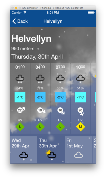
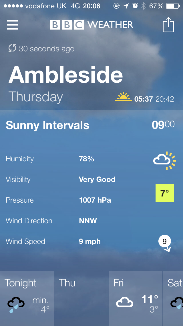
Notice however that I am only displaying some of the elements so it doesn’t look too crowded. What I really want to be able to do is to tap on one of the periods and have it expand a detail section to display all the elements for that period. I also want this to fill the whole width of the screen together with the panel I just tapped. I want the period panel to scroll to the side and for the detail section to slide out. This is very similar to how the BBC weather app works. As you can see below:

IMG_1191  IMG_1192  IMG_1193

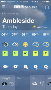
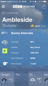
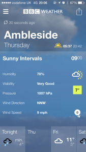
Another requirement here is for the tapped panel to either slide to the left or to the right depending on where its original position is. If it happens to be close to the right of the scroll area then I want it to slide to the right and for the detail to slide out to the left. If it were to always slide to the left then it would look a little odd because it would have to scroll most to the screen width. So it is more natural for it to slide to the closest edge.

That’s quite a requirement to tackle. Sounds like I need an Accordion control, which doesn’t come with Xamarin Forms, unsurprisingly. I couldn’t find one out there so I wrote my own.

It seemed like a natural choice to reuse my ItemsView as the base class, which already provides properties for the ItemsSource and ItemTemplate. Let’s have another quick look at what ItemsView looks like. You can find more about this in my previous post here.

using System;
using System.Linq;
using Xamarin.Forms;
using System.Collections;
using System.Collections.Generic;
using System.Windows.Input;
using Silkweb.Mobile.Core.Interfaces;

namespace Silkweb.Mobile.Core.Views
{
    public class ItemsView : Grid
    {
        protected ScrollView ScrollView;
        protected readonly ICommand SelectedCommand;
        protected readonly StackLayout ItemsStackLayout;

        public ItemsView()
        {
            ScrollView = new ScrollView
            {
                Orientation = ScrollOrientation.Horizontal
            };

            ItemsStackLayout = new StackLayout
            {
                Orientation = StackOrientation.Horizontal,
                Padding = new Thickness(0),
                Spacing = 0,
                HorizontalOptions = LayoutOptions.FillAndExpand
            };

            ScrollView.Content = ItemsStackLayout;
            Children.Add(ScrollView);

            SelectedCommand = new Command<object>(item =>
            {
                var selectable = item as ISelectable;
                if (selectable == null) return;
                
                SetSelected(selectable);
                SelectedItem = selectable.IsSelected ? selectable : null;
            });

            PropertyChanged += (sender, e) =>
            {
                if (e.PropertyName == "Orientation")
                {
                    ItemsStackLayout.Orientation = ScrollView.Orientation == ScrollOrientation.Horizontal ? StackOrientation.Horizontal : StackOrientation.Vertical;
                }

            };
        }

        protected virtual void SetSelected(ISelectable selectable)
        {
            selectable.IsSelected = true;
        }

        public bool ScrollToStartOnSelected { get; set; }

        public event EventHandler SelectedItemChanged;

        public static readonly BindableProperty ItemsSourceProperty =
            BindableProperty.Create<ItemsView, IEnumerable>(p => p.ItemsSource, default(IEnumerable<object>), BindingMode.TwoWay, null, ItemsSourceChanged);

        public IEnumerable ItemsSource
        {
            get { return (IEnumerable)GetValue(ItemsSourceProperty); }
            set { SetValue(ItemsSourceProperty, value); }
        }

        public static readonly BindableProperty SelectedItemProperty =
            BindableProperty.Create<ItemsView, object>(p => p.SelectedItem, default(object), BindingMode.TwoWay, null, OnSelectedItemChanged);

        public object SelectedItem
        {
            get { return (object)GetValue(SelectedItemProperty); }
            set { SetValue(SelectedItemProperty, value); }
        }

        public static readonly BindableProperty ItemTemplateProperty =
            BindableProperty.Create<ItemsView, DataTemplate>(p => p.ItemTemplate, default(DataTemplate));

        public DataTemplate ItemTemplate
        {
            get { return (DataTemplate)GetValue(ItemTemplateProperty); }
            set { SetValue(ItemTemplateProperty, value); }
        }

        private static void ItemsSourceChanged(BindableObject bindable, IEnumerable oldValue, IEnumerable newValue)
        {
            var itemsLayout = (ItemsView)bindable;
            itemsLayout.SetItems();
        }

        protected virtual void SetItems()
        {
            ItemsStackLayout.Children.Clear();

            if (ItemsSource == null)
                return;

            foreach (var item in ItemsSource)
                ItemsStackLayout.Children.Add(GetItemView(item));

            SelectedItem = ItemsSource.OfType<ISelectable>().FirstOrDefault(x => x.IsSelected);
        }

        protected virtual View GetItemView(object item)
        {
            var content = ItemTemplate.CreateContent();
            var view = content as View;
            if (view == null) return null;

            view.BindingContext = item;

            var gesture = new TapGestureRecognizer
            {
                Command = SelectedCommand,
                CommandParameter = item
            };

            AddGesture(view, gesture);

            return view;
        }

        protected void AddGesture(View view, TapGestureRecognizer gesture)
        {
            view.GestureRecognizers.Add(gesture);

            var layout = view as Layout<View>;

            if (layout == null)
                return;

            foreach (var child in layout.Children)
                AddGesture(child, gesture);
        }

        private static void OnSelectedItemChanged(BindableObject bindable, object oldValue, object newValue)
        {
            var itemsView = (ItemsView)bindable;
            if (newValue == oldValue)
                return;

            var selectable = newValue as ISelectable;
            itemsView.SetSelectedItem(selectable ?? oldValue as ISelectable);
        }

        protected virtual void SetSelectedItem(ISelectable selectedItem)
        {
            var items = ItemsSource;

            foreach (var item in items.OfType<ISelectable>())
                item.IsSelected = selectedItem != null && item == selectedItem && selectedItem.IsSelected;

            var handler = SelectedItemChanged;
            if (handler != null)
                handler(this, EventArgs.Empty);
        }

    }
}

I have amended ItemView slightly so that it derives from Grid rather than ScrollView directly as before. You will see why I have done this in a moment.

My Accordion control will extend this and add a new BindableProperty for the ItemDetailTemplate, which will provide the template for the detail. I also handle the changed event for this so that I can create the content of the template when it is set. Here’s the code so far:

 
    public class Accordion : ItemsView
    {
       private View _detailView;

        public static readonly BindableProperty ItemDetailTemplateProperty =
            BindableProperty.Create<Accordion, DataTemplate>(p => p.ItemDetailTemplate, default(DataTemplate)
            , BindingMode.TwoWay, null, ItemDetailTemplateChanged);

        public DataTemplate ItemDetailTemplate
        {
            get { return (DataTemplate)GetValue(ItemDetailTemplateProperty); }
            set { SetValue(ItemDetailTemplateProperty, value); }
        }

        private static void ItemDetailTemplateChanged(BindableObject bindable, DataTemplate oldvalue, DataTemplate newvalue)
        {
            var Accordion = bindable as Accordion;
            if (Accordion == null) return;
            Accordion.CreateDetailView();
        }

        private void CreateDetailView()
        {
            var itemDetail = ItemDetailTemplate.CreateContent() as View;

            _detailView = new ScrollView
            {
                Content = itemDetail
            };
        }
    }

Notice I am wrapping the item detail in a ScrollView. This allows me to naturally scroll the item detail into view within its own scroll view. This took me ages to figure out, but as you will see shortly it works very effectively.

Next I need to handle the expanding and collapsing of the item when it is tapped. For this I need to override the SetSelectedItem method, which I have made virtual in the ItemsView. This is called when an item is tapped and its IsSelected property gets set. Note that all the items must implement ISelectable. For this to work correctly I also need to toggle the IsSelected property of the item. I do this by overriding the SetSelected method of ItemsView and toggling the value like this:

        protected override void SetSelected(ISelectable selectable)
        {
            selectable.IsSelected = !selectable.IsSelected;
        }

The code in the SetSelectItem override needs to check whether the item is selected or not and animate the collapse or expanding of the detail and position the tapped item. I found this a real challenge and spent days figuring this out. There are a number of animation extension methods available in Xamarin Forms including Animate. This allows you to supply an animation action that will get invoked as the animation runs and is passed the percentage from 0 to 1 of the animation sequence. What I needed to figure out was how to expand the detail content and scroll the item to its nearest edge both at the same time.

Firstly I also need to know the current scroll position so that I can scroll the item relative to the current scroll position. I discovered that there isn’t a property on ScrollView that tells me this. However, if I handle the Scrolled event the ScrolledEventArgs does have the scroll x and y positions, so I capture this and save it as a private member.

        private ScrolledEventArgs _scrolledEventArgs;

        public Accordion()
        {
            ScrollView.Scrolled += AccordionViewScrolled;
        }

        private void AccordionViewScrolled(object sender, ScrolledEventArgs e)
        {
            _scrolledEventArgs = e;
        } 

Now that I have this information let’s take a look at the code for the SetSelectItem method:

        protected override void SetSelectedItem(ISelectable selectedItem)
        {
            base.SetSelectedItem(selectedItem);

            var element = ItemsStackLayout.Children.FirstOrDefault(x => x.BindingContext == selectedItem);
            if (element == null) return;

            var index = ItemsStackLayout.Children.IndexOf(element);
            var scrollPosition = _scrolledEventArgs != null ? _scrolledEventArgs.ScrollX : 0;

            if (selectedItem.IsSelected)
            {
                var scrollDistance = element.X - scrollPosition; // the distance to scroll
                _lastScrollPosition = scrollPosition;

                if (Device.OS != TargetPlatform.WinPhone)
                {
                    if (ItemsStackLayout.Children.Contains(_detailView))
                        ItemsStackLayout.Children.Remove(_detailView);
                }
                else
                    CreateDetailView();

                _detailView.BindingContext = selectedItem;

                if (scrollDistance < Width / 2)
                    ItemsStackLayout.Children.Insert(index + 1, _detailView);
                else
                    ItemsStackLayout.Children.Insert(index, _detailView);

                var width = Width - element.Width; // width to expand to

                _detailView.Animate("expand",
                    x =>
                    {
                        var change = width * x;
                        _detailView.WidthRequest = change;

                        var position = scrollPosition + (scrollDistance * x);
                        ScrollView.ScrollToAsync(position, 0, false);

                    }, 0, 400, Easing.Linear, (d, b) =>
                    {
                        _overlay.IsVisible = true;
                    });
            }
            else
            {
                var width = _detailView.WidthRequest; // width to collapse
                var scrollDistance = scrollPosition - _lastScrollPosition; // the distance to scroll

                _detailView.Animate("collapse",
                    x =>
                    {
                        var change = width * x;
                        _detailView.WidthRequest = width - change;

                        var position = scrollPosition - (scrollDistance * x);
                        ScrollView.ScrollToAsync(position, 0, false);

                    }, 0, 400, Easing.Linear, (d, b) =>
                    {
                        ItemsStackLayout.Children.Remove(_detailView);
                        _detailView.Parent = null;
                        _overlay.IsVisible = false;
                    });
            }
        }

As you can see there is a lot going on here, so let’s break it down.

Firstly I get the actual visual element bound to the selected item and work out what its index is.

var element = ItemsStackLayout.Children.FirstOrDefault(x => x.BindingContext == selectedItem);
if (element == null) return;

var index = ItemsStackLayout.Children.IndexOf(element);

And I get the current scroll position if there is one (we may not have scrolled at all).

var scrollPosition = _scrolledEventArgs != null ? _scrolledEventArgs.ScrollX : 0;

Then I check if the item is selected. Let’s take a look at the selected code which expands the detail view.

Firstly I calculate the distance I need to scroll from the item position to the current scroll position. I also need to save the current scroll position so that I can scroll back to it later when I collapse the item.

var scrollDistance = element.X - scrollPosition; // the distance to scroll
_lastScrollPosition = scrollPosition;

Next I need to remove the item detail view if it already exists in the item StackLayout. This ensures that I am only reusing the item detail view once. I also discovered a strange issue with Windows Phone reusing the details view which caused it to throw an exception so I have a device specific case for this that recreates the detail view for Windows Phone.

if (Device.OS != TargetPlatform.WinPhone)
{
    if (ItemsStackLayout.Children.Contains(_detailView))
        ItemsStackLayout.Children.Remove(_detailView);
}
else
    CreateDetailView();

I then set the BindingContext of the detail view to the selectedItem and insert the detail view into the item StackLayout. This needs to be inserted after the index of the current element if we have selected an item before the centre point or before it if the selected item is at or beyond the centre point.

 
_detailView.BindingContext = selectedItem;

if (scrollDistance < Width / 2)
    ItemsStackLayout.Children.Insert(index + 1, _detailView);
else
    ItemsStackLayout.Children.Insert(index, _detailView);

Before I animate I need to calculate the width that I need to expand the detail to. This is simply the total width less the width of the selected element.

 
var width = Width - element.Width; // width to expand to

Now for the fun part. The Animate method needs to set the width of the detail view to the above width multiplied by the animation percentage passed to the Animate method. I also need to scroll the selected item by the scroll distance I calculated above by multiplying the scroll distance by the animation percentage and adding it to the current scroll position. I then call the ScrollToAsync method on the ScrollView to scroll it to this position with the animate flag set to false because I am doing the animation.

    _detailView.Animate("expand",
        percent =>
        {
            var change = width * percent;
            _detailView.WidthRequest = change;

            var position = scrollPosition + (scrollDistance * percent);
            ScrollView.ScrollToAsync(position, 0, false);

        }, 0, 400, Easing.Linear, (d, b) =>
        {
            _overlay.IsVisible = true;
        }); 

I set the animation time to 400ms and specify Linear Easing. Notice there is also another action that is the completed action. I will cover this shortly.

Now let’s take a look at the collapse code.

    var width = _detailView.WidthRequest; // width to collapse
    var scrollDistance = scrollPosition - _lastScrollPosition; // the distance to scroll

    _detailView.Animate("collapse",
        percent =>
        {
            var change = width * percent;
            _detailView.WidthRequest = width - change;

            var position = scrollPosition - (scrollDistance * percent);
            ScrollView.ScrollToAsync(position, 0, false);

        }, 0, 400, Easing.Linear, (d, b) =>
        {
            ItemsStackLayout.Children.Remove(_detailView);
            _detailView.Parent = null;
            _overlay.IsVisible = false;
        });

This time the width to collapse is just the width of the detail view. The distance to scroll is the current scroll position less the last scroll position, which we saved when the item was expanded. This is the distance I need to scroll the item back to.

The Animate method calculates the amount to reduce the width by and subtracts this from the width and sets this to the detail view WidthRequest. I then work out the amount I need to scroll using the animation percentage and call the ScrollToAsync method as before. Finally notice that the animation completed action then removes the detail view from the items StackLayout and sets its parent to null to ensure it isn’t related anymore.

Finally, notice the code which sets _overlay.IsVisible to false. When the Item is expanded I don’t want to be able to scroll the items. I want the ScrollView to be fixed until tapping it again collapses the item. I deliberated over this and tried all sorts of crazy things before I discovered a very simple solution. All I needed to do was to position a transparent control over the top of the scroll view, which stops it from interacting with any gestures. This overlay however does need to handle tap gestures so that it can collapse the item. I therefore create a ContentView as a private member with a tap genture, which I add to the Accordion with its visibility initially set to false. This is the reason why the ItemsView is now a Grid so that I can add this overlay. I guess this also allows any kind of adorner to be added. Here’s the code in the constructor.

        private readonly ContentView _overlay;

        public Accordion()
        {
            ...

            _overlay = new ContentView
            {
                IsVisible = false
            };

            AddGesture(_overlay, new TapGestureRecognizer(view =>
            {
                _overlay.IsVisible = false;
                SelectedCommand.Execute(SelectedItem);
            }));

            Children.Add(_overlay);
        }

The tap gesture sets the visibility of the overlay to false and then calls the SelectCommand to toggle the IsSelected of the item. I then set the visibility of the overlay accordingly in the animation completed call-backs of the Animate methods.

Phew! That took quite some explaining. I hope you managed to follow along. Let’s take a look at the Accordion code in full.

using System.Linq;
using Silkweb.Mobile.Core.Interfaces;
using Xamarin.Forms;

namespace Silkweb.Mobile.Core.Views
{
    public class Accordion : ItemsView
    {
        private View _detailView;
        private ScrolledEventArgs _scrolledEventArgs;
        private double _lastScrollPosition;
        private readonly ContentView _overlay;

        public Accordion()
        {
            ScrollView.Scrolled += AccordionViewScrolled;

            _overlay = new ContentView
            {
                IsVisible = false
            };

            AddGesture(_overlay, new TapGestureRecognizer(view =>
            {
                _overlay.IsVisible = false;
                SelectedCommand.Execute(SelectedItem);
            }));

            Children.Add(_overlay);
        }

        private void AccordionViewScrolled(object sender, ScrolledEventArgs e)
        {
            _scrolledEventArgs = e;
        }

        protected override void SetSelected(ISelectable selectable)
        {
            selectable.IsSelected = !selectable.IsSelected;
        }

        public static readonly BindableProperty ItemDetailTemplateProperty =
            BindableProperty.Create<Accordion, DataTemplate>(p => p.ItemDetailTemplate, default(DataTemplate)
            , BindingMode.TwoWay, null, ItemDetailTemplateChanged);

        public DataTemplate ItemDetailTemplate
        {
            get { return (DataTemplate)GetValue(ItemDetailTemplateProperty); }
            set { SetValue(ItemDetailTemplateProperty, value); }
        }

        private static void ItemDetailTemplateChanged(BindableObject bindable, DataTemplate oldvalue, DataTemplate newvalue)
        {
            var accordionView = bindable as Accordion;
            if (accordionView == null) return;
            accordionView.CreateDetailView();
        }

        private void CreateDetailView()
        {
            var itemDetail = ItemDetailTemplate.CreateContent() as View;

            _detailView = new ScrollView
            {
                Content = itemDetail
            };
        }

        protected override void SetSelectedItem(ISelectable selectedItem)
        {
            base.SetSelectedItem(selectedItem);

            var element = ItemsStackLayout.Children.FirstOrDefault(x => x.BindingContext == selectedItem);
            if (element == null) return;

            var index = ItemsStackLayout.Children.IndexOf(element);
            var scrollPosition = _scrolledEventArgs != null ? _scrolledEventArgs.ScrollX : 0;

            if (selectedItem.IsSelected)
            {
                var scrollDistance = element.X - scrollPosition; // the distance to scroll
                _lastScrollPosition = scrollPosition;

                if (Device.OS != TargetPlatform.WinPhone)
                {
                    if (ItemsStackLayout.Children.Contains(_detailView))
                        ItemsStackLayout.Children.Remove(_detailView);
                }
                else
                    CreateDetailView();

                _detailView.BindingContext = selectedItem;

                if (scrollDistance < Width / 2)
                    ItemsStackLayout.Children.Insert(index + 1, _detailView);
                else
                    ItemsStackLayout.Children.Insert(index, _detailView);

                var width = Width - element.Width; // width to expand to

                _overlay.IsVisible = true;

                _detailView.Animate("expand",
                    percent =>
                    {
                        var change = width * percent;
                        _detailView.WidthRequest = change;

                        var position = scrollPosition + (scrollDistance * percent);
                        ScrollView.ScrollToAsync(position, 0, false);

                    }, 0, 400, Easing.Linear, (d, b) =>
                    {
                        _overlay.IsVisible = true;
                    });
            }
            else
            {
                var width = _detailView.WidthRequest; // width to collapse
                var scrollDistance = scrollPosition - _lastScrollPosition; // the distance to scroll

                _detailView.Animate("collapse",
                    percentage =>
                    {
                        var change = width * percentage;
                        _detailView.WidthRequest = width - change;

                        var position = scrollPosition - (scrollDistance * percentage);
                        ScrollView.ScrollToAsync(position, 0, false);

                    }, 0, 400, Easing.Linear, (d, b) =>
                    {
                        ItemsStackLayout.Children.Remove(_detailView);
                        _detailView.Parent = null;
                        _overlay.IsVisible = false;
                    });
            }
        }
    }
}

There’s actually not a huge amount of code really for what I am doing. Now let’s use this in my app. Here’s the Xaml for my mountain site forecast view.

<ContentView ...>

  <ContentView.Resources>
    <ResourceDictionary>
      
      <DataTemplate x:Key="itemItemplate">
        <views:SiteForecastPeriodView WidthRequest="75" IsVisible="{Binding IsVisible}" />
      </DataTemplate>

      <DataTemplate x:Key="detailItemplate">
        <views:SiteForecastPeriodDetailView />
      </DataTemplate>

    </ResourceDictionary>
  </ContentView.Resources>

  <AbsoluteLayout>
    <StackLayout Spacing="0"
                 AbsoluteLayout.LayoutBounds="0.0, 1, 1, 0.95"
                 AbsoluteLayout.LayoutFlags="All">
      <StackLayout Padding="5,0,5,0">
        <Label Text="{Binding Title}" Style="{StaticResource largeHeaderStyle}" />
        <Label Text="{Binding Altitude, StringFormat='{0} meters'}" Style="{StaticResource textStyle}" />
        <Label Text="{Binding Day}" Style="{StaticResource mediumHeaderStyle}" FontAttributes="None" />
      </StackLayout>

      <coreViews:Accordion Padding="0,10,0,0" ItemsSource="{Binding Periods}"
                           ItemTemplate="{StaticResource itemItemplate}"
                           ItemDetailTemplate="{StaticResource detailItemplate}"
                           VerticalOptions="FillAndExpand"/>
    </StackLayout>
  </AbsoluteLayout>
</ContentView> 

As you can see there’s not a lot to it. I define two data templates for both the item and the item detail templates. These simply display the views I have created for each template so that it keeps this view nice and clean. I then declare an Accordion within my view and set the templates accordingly. Notice to that the ItemsSource is bound to a property called Periods on my view model. I’m not going to show you the view model as I don’t think it’s that relevant here.

Now let’s spin this up and see how it looks on all 3 platforms with these videos.


Wow! That looks really great I’m sure you’ll agree. And again this was all done without the use of any Custom Renders and is pure Xamarin Forms.

You may have noticed the use of AbsoluteLayout and the curious use of the LayoutBounds. This will be the subject of my next post.

Animating the TabbedView

It’s been a while since my last post as, amongst other things, I’ve been busy working on my mountain weather app. So I thought it was about time I shared my progress with an update on my TabbedView.

Screen Shot 2015-04-19 at 11.30.14

In part 10 of my “Creating a Xamarin Forms App” series I introduced my TabbedView, which provides a really nice customized tabbed view that allows the tabs to scroll horizontally. I wanted to improve the transitions between the views when changing tabs because I was getting a small delay when tapping on the tab, which was quite evident on Android.

The crux of the problem is the TemplateContentView, taken from Xamarin Forms Labs, which I use to bind to the selected item. As the selected item changes the BindingContext of the TemplateContentView is updated. The problem with this is the control needs to rebind the template to the updated BindingContext and this seems to cause the lag. I also wanted to have a nice fading transition between the views when switching tabs and display a background image for each tab. This clearly wasn’t going to work with just a single TemplateContentView. I needed to rethink the TabbedView.

My first thought was to have two TemplateContentViews and switch between them as the selected item changed. This is quite a common technique used for animation transitions because it allows you to fade one view out whilst fading in the other. I found this problematic however as it didn’t really fix the lag issue and the fading transitions, particularly on Android, where not smooth. After much trail and error I found a better approach using the Grid control.

The Grid control can be much more useful than you might think. Not only can you use it to layout rows and columns, it is a great control for overlaying content. You can place any number of controls in any row/column and create really great effects using opacity. You don’t even need to define any rows or columns; you can use it as a single container to overlay content. This technique is quite commonly used in WPF and works equally well with XF.

You can get a similar effect using the AbsoluteLayout control but I find this tricky to work with because you have to define the positioning of every control, relative or absolute, and the syntax for this is both very verbose and difficult to follow.

The Grid however allows us to maintain a much better flow layout and used together with other flow layouts, like StackLayout, we can produce some really nice overlay effects in a very simple way. Not only that but it provides me with a nice simple solution I was looking for.

Let’s take a look at the Xaml for my original TabbedView.

<Grid 
  xmlns="http://xamarin.com/schemas/2014/forms" 
  xmlns:x="http://schemas.microsoft.com/winfx/2009/xaml" 
  x:Class="Silkweb.Mobile.Core.Views.TabbedView"
  xmlns:cv="clr-namespace:Silkweb.Mobile.Core.Views;assembly=Silkweb.Mobile.Core">

	<Grid.RowDefinitions>
		<RowDefinition Height="*" />
		<RowDefinition Height="Auto" />
	</Grid.RowDefinitions>

	<cv:TemplateContentView Grid.Row="0" x:Name="content" />
	<cv:ItemsView Grid.Row="1" x:Name="items" />
</Grid>

Here is my updated version replacing the TemplateContentView with a Grid and introducing another Grid for the background images.

<Grid
  xmlns="http://xamarin.com/schemas/2014/forms"
  xmlns:x="http://schemas.microsoft.com/winfx/2009/xaml"
  x:Class="Silkweb.Mobile.Core.Views.TabbedGridView"
  xmlns:cv="clr-namespace:Silkweb.Mobile.Core.Views;assembly=Silkweb.Mobile.Core">

  <Grid.RowDefinitions>
    <RowDefinition Height="*" />
    <RowDefinition Height="Auto" />
  </Grid.RowDefinitions>

  <Grid x:Name="backgroundGrid" Grid.Row="0" Grid.RowSpan="2" />
  <Grid x:Name="contentGrid" Grid.Row="0" />
  <cv:ItemsView x:Name="itemsView" Grid.Row="1" />

</Grid>

As you can see they are similar in that both have an outer Grid that defines two rows. The first being for the content and the second containing my ItemsView for the Tabs.

You can find more about ItemsView in my previous post here, but essentially it allows me to provide an ItemsSource and a DataTemplate which I can hook up to a StackLayout.

I have replaced the TemplateContentView with a Grid called contentGrid and added another Grid called backgroundGrid that will contain content for the background. Notice that this Grid has a RowSpan of 2 so that the background spans the entire control. What’s interesting is that both the contentGrid and the itemsView will be overlaid over the top of the background. Provided they have some transparency we will still see the background behind them.

Now let’s take a look at the code for this control.

    public partial class TabbedGridView : Grid
    {
        private readonly IDictionary<ISelectable, View> _views = new Dictionary<ISelectable, View>();

        public TabbedGridView()
        {
            InitializeComponent();
            itemsView.SelectedItemChanged += HandleSelectedItemViewChanged;
        }

        public static readonly BindableProperty ItemsSourceProperty =
            BindableProperty.Create<TabbedGridView, IEnumerable<ISelectable>>(p => p.ItemsSource,
                default(IEnumerable<ISelectable>),
                BindingMode.TwoWay, null, ItemsSourceChanged);

        public IEnumerable<ISelectable> ItemsSource
        {
            get { return (IEnumerable<ISelectable>)GetValue(ItemsSourceProperty); }
            set { SetValue(ItemsSourceProperty, value); }
        }

        public static readonly BindableProperty BackgroundTemplateProperty =
            BindableProperty.Create<TabbedGridView, DataTemplate>(p => p.BackgroundTemplate, default(DataTemplate),
                BindingMode.TwoWay);

        public DataTemplate BackgroundTemplate
        {
            get { return (DataTemplate)GetValue(BackgroundTemplateProperty); }
            set { SetValue(BackgroundTemplateProperty, value); }
        }

        public static readonly BindableProperty TabTemplateProperty =
            BindableProperty.Create<TabbedGridView, DataTemplate>(p => p.TabTemplate, default(DataTemplate),
                BindingMode.TwoWay, null, TabTemplateChanged);

        public DataTemplate TabTemplate
        {
            get { return (DataTemplate)GetValue(TabTemplateProperty); }
            set { SetValue(TabTemplateProperty, value); }
        }

        public static readonly BindableProperty ItemTemplateProperty =
            BindableProperty.Create<TabbedGridView, DataTemplate>(p => p.ItemTemplate, default(DataTemplate),
                BindingMode.TwoWay);

        public DataTemplate ItemTemplate
        {
            get { return (DataTemplate)GetValue(ItemTemplateProperty); }
            set { SetValue(ItemTemplateProperty, value); }
        }

        public static readonly BindableProperty ItemTemplateSelectorProperty =
            BindableProperty.Create<TabbedGridView, TemplateSelector>(p => p.ItemTemplateSelector,
                default(TemplateSelector), BindingMode.Default);

        public TemplateSelector ItemTemplateSelector
        {
            get { return (TemplateSelector)GetValue(ItemTemplateSelectorProperty); }
            set { SetValue(ItemTemplateSelectorProperty, value); }
        }

        public static readonly BindableProperty SelectedItemProperty =
            BindableProperty.Create<TabbedGridView, ISelectable>(p => p.SelectedItem, default(ISelectable),
                BindingMode.TwoWay, null, SelectedItemChanged);

        public ISelectable SelectedItem
        {
            get { return (ISelectable)GetValue(SelectedItemProperty); }
            set { SetValue(SelectedItemProperty, value); }
        }

        private static void ItemsSourceChanged(BindableObject bindable, IEnumerable<ISelectable> oldValue,
            IEnumerable<ISelectable> newValue)
        {
            if (Equals(newValue, oldValue)) return;
            var behavior = (TabbedGridView)bindable;
            behavior.SetItemsSource(newValue);
        }

        private static void SelectedItemChanged(BindableObject bindable, ISelectable oldValue, ISelectable newValue)
        {
            if (Equals(newValue, oldValue)) return;
            var behavior = (TabbedGridView)bindable;
            behavior.AddItemView(newValue);
        }

        private static void TabTemplateChanged(BindableObject bindable, DataTemplate oldValue, DataTemplate newValue)
        {
            var view = (TabbedGridView)bindable;
            view.itemsView.ItemTemplate = newValue;
        }

        private void SetItemsSource(IEnumerable<ISelectable> itemsSource)
        {
            if (itemsSource == null) return;
            var items = itemsSource as IList<ISelectable> ?? itemsSource.ToList();

            itemsView.ItemsSource = items;

            foreach (var selectable in items)
            {
                if (BackgroundTemplate != null)
                {
                    var backgroundView = GetBackgroundView(selectable);
                    backgroundGrid.Children.Add(backgroundView);
                }

                if (Device.OS != TargetPlatform.WinPhone)
                    AddItemView(selectable);
            }
        }

        private void AddItemView(ISelectable item)
        {
            View view;
            if (!_views.TryGetValue(item, out view))
            {
                view = ItemTemplate != null
                    ? ItemTemplate.CreateContent() as View
                    : ItemTemplateSelector != null
                        ? ItemTemplateSelector.ViewFor(item)
                        : null;

                if (view == null) return;

                view.BindingContext = item;

                AddFadeBehavior(view);

                contentGrid.Children.Add(view);
                _views.Add(item, view);
            }
        }

        private View GetBackgroundView(ISelectable item)
        {
            var view = BackgroundTemplate.CreateContent() as View;
            if (view == null) return null;

            view.BindingContext = item;
            AddFadeBehavior(view);
            return view;
        }

        private void AddFadeBehavior(View view)
        {
            var behavior = new FadeBehavior();
            view.Behaviors.Add(behavior);
            behavior.SetBinding(FadeBehavior.IsSelectedProperty, "IsSelected");
        }

        private void HandleSelectedItemViewChanged(object sender, EventArgs e)
        {
            SelectedItem = itemsView.SelectedItem as ISelectable;
        }
    }

Most of the code simply defines the following BindableProperties:

ItemsSource – The list of Selectable View Models we want to bind to.
BackgroundTemplate – The DataTemplate for the background.
TabTemplate – The DataTemplate for each Tab
ItemTemplate – The DataTemplate for the item content
ItemTemplateSelector – Optional Template Selector for the item content
SelectedItem – The currently selected item.

It’s also worth noting that the view models for each item must implement the ISelectable interface for this control, which is defined as:

    public interface ISelectable
    {
        bool IsSelected { get; set; }

        ICommand SelectCommand { get; set; }
    }

I have provided value changed handers for ItemsSource, SelectedItem and TabTemplate. The most significant of these is ItemsSourceChanged, which calls SetItemsSource. This wires up the ItemsSource of the itemsView for the Tabs and then iterates through the items. For each item a background is created from the BackgroundTemplate and is added to the backgroundGrid, then the content is created and added to the contentGrid using the AddItemView method. This creates the content either from the ItemTemplate or the ItemTemplateSelector, sets the BindingContext and adds a Fade Behavior before adding the control to the contentGrid. Also notice I am caching these views in a dictionary keyed by the item, more on this in a moment. But what is this Fade Behavior?

I have created a FadeBehavior using Behavior that allows me to apply a Fade animation whenever the IsSelected property changes. Let’s take a look at this.

    public class FadeBehavior : BindableBehavior<VisualElement>
    {
        public FadeBehavior()
        {
            FadeInAnimationLength = 250;
            FadeOutAnimationLength = 350;
        }
        public static readonly BindableProperty IsSelectedProperty =
            BindableProperty.Create<FadeBehavior, bool>(p => p.IsSelected, false, BindingMode.Default, null, IsSelectedChanged);

        private static void IsSelectedChanged(BindableObject bindable, bool oldvalue, bool newvalue)
        {
            FadeBehavior behavior = bindable as FadeBehavior;
            if (behavior == null || behavior.AssociatedObject == null) return;
            behavior.Animate();
        }

        private void Animate()
        {
            if (IsSelected)
                AssociatedObject.IsVisible = true;

            AssociatedObject.FadeTo(
                IsSelected ? 1 : 0, 
                IsSelected ? FadeInAnimationLength : FadeOutAnimationLength, 
                Easing.Linear)
                .ContinueWith(x =>
                {
                    if (!IsSelected)
                        AssociatedObject.IsVisible = false;
                }, TaskScheduler.FromCurrentSynchronizationContext());
        }

        public bool IsSelected
        {
            get { return (bool)GetValue(IsSelectedProperty); }
            set { SetValue(IsSelectedProperty, value); }
        }

        public uint FadeInAnimationLength { get; set; }

        public uint FadeOutAnimationLength { get; set; }

        protected override void OnAttachedTo(VisualElement visualElement)
        {
            base.OnAttachedTo(visualElement);
            visualElement.Opacity = 0;
            visualElement.IsVisible = false;
        }
    }

This defines an IsSelected BindableProperty with a change handler that applies a FadeTo animation when this property changes. FadeTo is part of a number of animation extension methods available with XF. Notice also that I am initialising the attached view with an opacity of 0 and setting it’s IsVisible property to false in the OnAttachedTo override. In the change handler IsVisible is set to true when IsSelected is true. The FadeTo animation is then applied. This either animates the Opacity to 1 or 0 depending on the newValue of IsSelected. Effectively fading in if selected or fading out if unselected. I have also provide properties to set the FadeIn and FadeOut Animation Length which I set defaults for. Interestingly FadeTo, along with the other animation extension methods, returns a Task. This means that we can provide a continuation when the animation is complete. In this case I want to set the IsVisible property to false when IsSelected equals false. But why bother setting the IsVisible property at all if we are already setting Opacity? The reason for this is two fold. It means that the view won’t get rendered in the visual tree but it will still get bound to it’s BindingContext. This provides a much smoother animation transition. And secondly it means that overlaid controls won’t obscure any gestures for the currently selected view. I discovered this to be true on both Android and Windows Phone where tap gestures didn’t work property even though an overlay had zero opacity. So better to ensure that any views which are not selected are not visible once the animation sequence has completed.

Back in the TabbedGridView I apply theFadeBahavior as follows:

    private void AddFadeBehavior(View view)
    {
        var behavior = new FadeBehavior();
        view.Behaviors.Add(behavior);
        behavior.SetBinding(FadeBehavior.IsSelectedProperty, "IsSelected");
    }

Notice here that I am binding the IsSelected property of the behavior to the IsSelected property of the view it is attached to. I apply the FadeBehavior to both the item content and also to the background content before they are added to the Grids. This means that initially these controls will have IsVisible set to false and have opacity set to zero, and both will Invoke the FadeTo animation when IsSelected changes.

Notice that in SetItemsSource I have applied a platform tweak for WinPhone. This does not add the item content for each item when the Item Source is set. I was getting some strange behavior doing this with Windows Phone. It caused no content to be displayed at all even when the FadeBehavior made the selected item visible. As an alternative the SelectedItemChanged handler also calls AddItemView which checks to see if the view has already been added by checking the views dictionary. First time the item is selected it will get created and added to the content grid. I could just do this for the other platforms but I get a smoother transition if I preload the views. I may take a further look at this later but for now this WinPhone platform tweak works ok and highlights how we can include these platform optimizations in our code.

Now all I need to do is replace my previous TabbedView with my new TabbedGridView. Here is the Xaml for my AreaForecastReportView in my Mountain Weather App.

<?xml version="1.0" encoding="utf-8"?>
<ContentPage
	xmlns="http://xamarin.com/schemas/2014/forms"
	xmlns:x="http://schemas.microsoft.com/winfx/2009/xaml"
	x:Class="Silkweb.Mobile.MountainWeather.Views.AreaForecastReportView"
	xmlns:cv="clr-namespace:Silkweb.Mobile.Core.Views;assembly=Silkweb.Mobile.Core"
	xmlns:ex="clr-namespace:Silkweb.Mobile.Core.Extensions;assembly=Silkweb.Mobile.Core"
  xmlns:d="http://schemas.microsoft.com/expression/blend/2008"
  xmlns:mc="http://schemas.openxmlformats.org/markup-compatibility/2006"
  xmlns:viewModels="clr-namespace:Silkweb.Mobile.MountainWeather.ViewModels;assembly=Silkweb.Mobile.MountainWeather"
  mc:Ignorable="d"
  d:DataContext="{d:DesignInstance Type=viewModels:AreaForecastReportViewModel}"
	Title="{Binding Title}" BackgroundColor="{StaticResource backgroundColor}">
  <ContentPage.Resources>
    <ResourceDictionary>
      
      <Style x:Key="tabGridStyle" TargetType="Grid">
        <Setter Property="BackgroundColor" Value="Transparent" />
        <Style.Triggers>
          <DataTrigger Binding="{Binding IsSelected}" TargetType="Grid" Value="False">
            <Setter Property="BackgroundColor" Value="{StaticResource highlightColor}" />
          </DataTrigger>
        </Style.Triggers>
      </Style>

      <DataTemplate x:Key="tabTemplate">
        <Grid WidthRequest="100" HeightRequest="100" Padding="1"
              d:DataContext="{d:DesignInstance Type=viewModels:WeatherDayViewModel}">
          <Grid Style="{StaticResource tabGridStyle}">
            <StackLayout Padding="5" Spacing="0">
              <Label Text="{Binding Date, StringFormat='{0:ddd}'}" Font="Mirco" VerticalOptions="Start" HorizontalOptions="Start"
                     TextColor="{ex:ApplicationResource navigationBarTextColor}" />
              <Label Text="{Binding Date, Converter={StaticResource dateTimeConverter}, ConverterParameter='d{0} MMM'}" Font="Mirco"
                     VerticalOptions="Start" HorizontalOptions="Start" TextColor="{ex:ApplicationResource navigationBarTextColor}" />
              <Image Source="{Binding Icon}" VerticalOptions="Start" HorizontalOptions="Center" WidthRequest="48" HeightRequest="48" />
            </StackLayout>
          </Grid>
        </Grid>
      </DataTemplate>

      <DataTemplate x:Key="itemTemplate">
        <cv:ViewLocatorControl />
      </DataTemplate>

      <DataTemplate x:Key="backgroundImageTemplate">
        <Grid d:DataContext="{d:DesignInstance Type=viewModels:WeatherDayViewModel}">
          <Image Source="{Binding BackgroundImage}" Aspect="AspectFill" />
          <BoxView BackgroundColor="{Binding Tint, Converter={StaticResource stringToColorConverter}}" />
        </Grid>
      </DataTemplate>

    </ResourceDictionary>
  </ContentPage.Resources>

  <ContentPage.ToolbarItems>
    <ToolbarItem Name="Hazards" Command="{Binding ShowHazardsCommand}" />
  </ContentPage.ToolbarItems>

  <Grid>
    <cv:TabbedGridView x:Name="tabbedGridView" ItemsSource="{Binding Items}"
                       TabTemplate="{StaticResource tabTemplate}" ItemTemplate="{StaticResource itemTemplate}"
                       BackgroundTemplate="{StaticResource backgroundImageTemplate}" />

    <ActivityIndicator IsRunning="{Binding IsBusy}" HorizontalOptions="Center" VerticalOptions="Center" />
    <cv:GradientBoxView StartColor="{StaticResource highlightColor}" EndColor="Transparent" HeightRequest="75" VerticalOptions="Start" />
  </Grid>
</ContentPage>

I have defined 3 Data Template’s for the TabTemplate, ItemTemplate and BackgroundTemplate in the resources. The content defines the TabbedGridView and sets the Templates accordingly. I also bind the ItemsSource to an Items property in my view model.

Note the use of d:DataContext which gives me design time intellisense support for my bindings. More on this in my previous post here.

The TabTemplate is the same as the previous version. The new Background Template defines a grid containing an Image bound to the BackgroundImage property on my ViewModel and a BoxView with a BackgroundColor with a Tint colour which is bound to a Tint property on my view model. This allows me to apply differing Tints to the background. This is a popular technique that darkens the image so that white text overlaid over the background is easier to read.

The ItemTemplate is of particular interest here. Let’s take a closer look at this.

      <DataTemplate x:Key="itemTemplate">
        <cv:ViewLocatorControl />
      </DataTemplate>

This contains just one control called ViewLocatorControl. This clever little control is responsible for resolving the correct view that has been registered with my ViewFactory from the bound view model. If you are not familiar with my view factory then it’s worth taking a look at my previous post on View Model First Navigation.

Let’s have a quick look at the code for the ViewLocatorControl.

    public class ViewLocatorControl : ContentView
    {
        private readonly IViewFactory _viewFactory;

        public ViewLocatorControl()
        {
            _viewFactory = ViewFactory.Instance;
            BindingContextChanged += OnBindingContextChanged;
        }

        private void OnBindingContextChanged(object sender, EventArgs eventArgs)
        {
            View view = _viewFactory.Resolve(BindingContext as IViewModel) as View;
            Content = view;

        }
    }

As you can see all this does is use the ViewFactory to resolve the view when the BindingContext changes and sets the content to the resolved view.

This required a slight modification to the ViewFactory to register and resolve a VisualElement instead of Page. This allow me to register and resolve both Views and Pages, which is much more flexible. In this case there are two different views registered with two different view models. This are registered like this.

    viewFactory.Register<AreaForecastViewModel, AreaForecastView>();
    viewFactory.Register<OutlookViewModel, OutlookView>();

This is really a nice alternative to defining a Template Selector using the TemplateSelector class from Xamarin Forms Labs which I was using previously.

The resolved view will then be overlaid over the background image to produce a really nice effect. The views also add some additional opacity effects over the content to produce a further effect.

Now lets see it in action with the following videos showing the animation transition effects as I switch tabs on all 3 platforms.

I think the result looks really nice and shows what is possible using Grid overlays and just a few simple controls.

I really like the results and hope you do to. This post shows some really nice things that are possible with Xamarin Forms without resorting to Custom Renderers.

Xaml v Code

I still see a fair amount of Xamarin Forms UI written in C# code. If you are not that familiar with Xaml then it may seem to make sense to code up your views this way, but you will be missing out on the benefits of Xaml. Not only that but there are some really exciting new features which make Xaml an even better way to express your views which I will discuss shortly.

I was going to define the benefits of Xaml but Charles Petzold has done a great job in the Preview of his forthcoming book, Creating Mobile Apps with Xamarin.Forms. There are some great chapters on Xaml and his ‘Xaml v Code’ chapter succinctly sums up why we should all be using Xaml rather than code.

“You will find that XAML provides a more succinct and elegant definition of the user interface, and has a visual structure that better mimics the tree organisation of the visual elements on the page. XAML is also generally easier to maintain and modify than equivalent code. “

I would go further and say that, with regards to MVVM in particular, Xaml defines the template for the view, which is a visualisation of your view model. This template should be expressed in markup in much the same way that we define views in the html. It provides a much more expressive way to ‘declare’ the view in a way that allows you to lay it out in a declarative manner, rather than imperatively in code. A code-based approach tends to lead the developer to ‘program’ the layout with logic, which might include loops or conditional code mingled with the layout code. With Xaml the declarative approach allows you to focus on the layout and provide better reusable solutions where logic is required in the form of behaviours, markup extensions and converters. It also allows you to think more clearly about the bindings and the relationship with the view model. Further more Xaml allows you to define data bindings and express properties in a much more succinct manner.

For example in code you can not define bindings in-line with the layout like this.

    Content = new StackLayout
    {
        Orientation = StackOrientation.Horizontal,
        Children =
        {
            new Label
            {
                Text = ?? can not bind here
            }
        }
    };

You have to create the label as a separate variable so that you can call SetBinding and then add that variable into the layout like this.

    var label = new Label();
    label.SetBinding(Label.TextProperty, new Binding("Name"));

    Content = new StackLayout
    {
        Orientation = StackOrientation.Horizontal,
        Children =
        {
            label
        }
    };

This I find very irritating and before long you have some very unwieldy code. In Xaml bindings are defined right in the property declaration so everything fits very neatly into layout declaration like this:

    <StackLayout Orientation="Horizontal">
      <Label Text="{Binding Name}" />
    </StackLayout> 

I’m sure you’ll agree that this is more succinct and easier to follow that the code above.

I come from a WPF background. I know that most WPF developers would find it very strange and perhaps be horrified to find anyone trying to define all their views in code. A receipt for disaster almost as your application and complexity grows.

I think one of the reasons why some developers have adopted the code approach is due to many of the early examples being code based due to the lack of intellisense and tooling support for Xaml with Xamarin Forms. This is no longer the case. Xamarin Studio has, since I’ve used it, always provided intellisense for Xaml. Visual Studio now has first class intellisense support with the release of the Xamarin Mobile Essentials Productivity Tools. If you haven’t already installed this then do so now. In additional if you are a R# user, which I strongly recommended for your own sake, it also provides fantastic tooling and intellisense support in the Xaml editor. Namespaces are auto resolved, advanced colour picker for colour selection, code correction and warnings all feature in the editor. In fact it is as good as you would get in WPF.

One other thing that I discovered recently which I am very excited about is support for intellisense for bindings. By that I mean the ability to explore the properties that are available to you on the type that your view will be bound to through its binding context. In WPF this is done using the following declaration:

xmlns:d="http://schemas.microsoft.com/expression/blend/2008"
xmlns:mc="http://schemas.openxmlformats.org/markup-compatibility/2006"
xmlns:viewModels="clr-namespace:Silkweb.Mobile.MountainWeather.ViewModels;assembly=Silkweb.Mobile.MountainWeather"
mc:Ignorable="d"
d:DataContext="{d:DesignInstance Type=viewModels:ForecastViewModel, IsDesignTimeCreatable=False}"

If you are not familiar with this the d: namespace provides some design-time support features, one of which is to define a design time data context for the type you will be binding to. The mc: namespace provides an Ignorable property that allows you to tell the xaml parser to ignore certain namespaces at runtime, namely the d: namespace. This all works in WPF and it also works in Xamarin Forms in design time to. However at runtime you will get an compilation error saying Markup Extension not found for d:DesignInstance.

Fortunately this has now been resolved with the help of Xaml Conditional Compilation (xcc) by firstfloorsoftware. You can find more about this on this forum post, which got me very exited about this feature. I followed the helpful Xamarin Forms how to. One additional thing you need to do though that I discovered here is you need to add the following Property Definition into any projects where you’re Xaml exists.

<XccRemoveIgnorableContent>True</XccRemoveIgnorableContent>

(Note: Make sure you follow this here).

I’m note sure why this isn’t documented or added as part of the install, but I guess this is very early days for this feature.

With this in place and the above namespaces and Design Instance defined I can now define Binding expressions and browse the types properties like this:

1
Even better I can even explore nested Properties of complex property types like this:

Screen Shot 2015-03-17 at 22.37.07

And if any of the bindings are invalid I get a warning with a squiggly line like this:

2

This is something you don’t even get if you try to define bindings in code, where you are restricted to using magic strings.

There is of course no designer yet for Xamarin Forms, but I don’t see that as an issue really. I never use the designer much in WPF really, preferring to define the Xaml by hand, similarly to how you would define Html in the web world. The designer is occasionally useful but it’s actually much easier to visualise what you are doing simply by looking at the Xaml. This can not be done quite so easily in code.

If you are still defining your views in code then you should consider embracing Xaml and it’s benefits. It will actually make you a better developer.

Xamarin Forms Succinctly, by Syncfusion

In my earlier post I reviewed Charting using Syncfusion Essential Studio for Xamarin Forms. I also discovered that Syncfusion have put together Xamarin Forms Succinctly, which is part of the Syncfusion Succinctly series.

Screen Shot 2015-03-11 at 21.39.58

Written by Derek Jenson, the Xamarin Forms Succinctly ebook can be downloaded for free here. It provides a great introduction to Xamarin Forms and offers an excellent chapter on Xaml, Pages and Views which I feel is currently lacking in the Xamarin Forms documentation. My only criticism is that it seems to have been written pre 1.3 which introduced the Application class and ditched the GetMainPage method. That said most of the content is well worthy of a read. I certainly found it useful and learnt some things along the way.

Download Xamarin Forms Succinctly here.

Grouping with ListView and TableView and the TableViewItemsSourceBehavior

When I select a mountain area in my weather App I want to display a list of options. These options will include forecasts, weather observations at various weather stations, avalanche and other information. I’d like to group these and display this using the native grouping features for each platform.

Both Xamarin Forms ListView and TableView have the ability to group data. I will explore both these options and show how we can create one view model structure that will cater for both approaches.

ListView allows data to be grouped, and optionally includes jump lists for quick navigation. James Montemagno from Xamarin provides us with an excellent example on how to do this here.

I took my inspiration for his generic Grouping class to create my own view model called, unsurprisingly, GroupViewModel.

    public class GroupViewModel<TKey, TItem> : ObservableCollection<TItem>
    {
        public TKey Key { get; private set; }

        public GroupViewModel(TKey key, IEnumerable<TItem> items)
        {
            Key = key;
            if (items != null)
                foreach (var item in items)
                    Items.Add(item);
        }
    }

I want each item to have a Title and a Command that I can execute when selected, so I created the following IItemViewModel.

    public interface IItemViewModel
    {
        string Title { get; set; }

        ICommand Command { get; set; }
    }

Now I can create an ItemsGroupViewModel of IItemViewModel like this, which is keyed by a string.

    public class ItemGroupViewModel : GroupViewModel<string, IItemViewModel>
    {
        public ItemGroupViewModel(string key, IEnumerable<IItemViewModel> items = null)
            : base(key, items)
        {
        }
    }

I also want to associate an object with the item view model, which might differ for each item, so I created the following generic implementation of the above interface, which adds an Items property.

    public class ItemViewModel<T> : ViewModelBase, IItemViewModel
    {
        public ItemViewModel(string title, Action<T> action, T item)
        {
            Title = title;
            Item = item;
            Command = new Command<T>(action);
        }

        public ICommand Command { get; set; }

        public T Item { get; set; }
    }
 

This allows me to add any type of ItemViewModel to the group, or groups.

Next I need a View Model to represent a list of groups, which also needs to include a page title to display for the groups called ItemGroupsViewModel.

    public class ItemGroupsViewModel : ViewModelBase 
    {
        public ItemGroupsViewModel(string title)
        {
            Title = title;
        }

        public IEnumerable<ItemGroupViewModel> Groups { get; set; }
    }

Now in my MountainAreaViewModel all I need to do is to create a list of options, which I can display when a mountain area is selected.

public ItemsViewModel Options { get; set; }

private void Initialise()
{
    var groups = new List<ItemGroupViewModel>
    {
        new ItemGroupViewModel("Forecasts")
        {
            new ItemViewModel<ForecastReportViewModel>("Met Office 5 day forecast", ShowForecast, ForecastReport),
            new ItemViewModel<SummitForecastViewModel>("Met Office Summit Forecasts", ShowSummitForecast, SummitForecast),
            new ItemViewModel<MWISForecastViewModel>("MWIS Weather Forecast", ShowMWISForecast, MWISForecast)
        },
        new ItemGroupViewModel("Other")
        {
            new ItemViewModel<AvalancheReportViewModel>("Sais Avalanche Report", ShowAvalancheForecast, AvalancheReport),
            new ItemViewModel<AreaInfoViewModel>("Area Info", ShowAreaInfo, AreaInfo)
        }
    };

    var locations = _observationService.GetAreaObservationLocations(_location.Id);
    if (locations != null)
    {
        groups.Insert(1, new ItemGroupViewModel("Weather Stations", 
            locations.Select(location => new ItemViewModel<ObservationLocation>(location.Name,
            ShowObservations, location))));
    }

    Options = new ItemGroupsViewModel("Options") { Groups = groups };
}

Assume here that my observationService returns a list of weather observation locations, which I then use to create a grouped list of weather stations. Notice that each item calls one of the methods, ShowForecast, ShowObservations etc, which are passed as an action to the ItemViewModel.

And finally I create a view displaying a ListView with its ItemSource bound to the Options property and ground by Key.

<ContentPage xmlns="http://xamarin.com/schemas/2014/forms"
             xmlns:x="http://schemas.microsoft.com/winfx/2009/xaml"
             xmlns:views="clr-namespace:Silkweb.Mobile.Core.Views;assembly=Silkweb.Mobile.Core"
             x:Class="Silkweb.Mobile.MountainWeather.Views.ItemsView"
             Title="{Binding Title}">
  <ListView ItemsSource="{Binding Groups}" HorizontalOptions="FillAndExpand" VerticalOptions="FillAndExpand"
            IsGroupingEnabled="True"
            GroupDisplayBinding="{Binding Key}">
    <ListView.ItemTemplate>
      <DataTemplate>
        <views:TextCellExtended Text="{Binding Title}"
                                ShowDisclosure="True" Command="{Binding Command}" CommandParameter="{Binding Item}" />
      </DataTemplate>
    </ListView.ItemTemplate>
  </ListView>
</ContentPage>

Notice here that I am also using the TextCellExtended, which allows me to display the disclosure chevron to indicate more items.

Running this in my app I can now see the following options when I select a weather area.

Screen Shot 2015-03-10 at 21.35.18

This is great, but it’s actually not quite what I wanted. I want the options to be displayed more like they are in the settings of the phone, which look more like this.

Screen Shot 2015-03-09 at 22.44.37

Notice here the groupings spaced out with a header. TableView allows us to create this kind of layout, defining TableSections for each group. Unfortunately TableView does not provide an ItemsSource property that allows it to bind to a list or items. You have to define each TableSection manually either in Xaml or in code. This got me thinking about creating a Behavior that would do this dynamically. What I need is a behavior that can bind to the above ItemGroupsViewModel and create the TableSections. This behavior also needs to be able to define an ItemTemplate property that defines the template for each item. I therefore created the following TableViewItemsSourceBehavior.

    public class TableViewItemsSourceBehavior : BindableBehavior<TableView>
    {
        public static readonly BindableProperty ItemsSourceProperty =
            BindableProperty.Create<TableViewItemsSourceBehavior, IEnumerable<ItemGroupViewModel>>(p => p.ItemGroupsSource, null, BindingMode.Default, null, ItemsSourceChanged);

        public IEnumerable<ItemGroupViewModel> ItemGroupsSource
        {
            get { return (IEnumerable<ItemGroupViewModel>)GetValue(ItemsSourceProperty); } 
            set { SetValue(ItemsSourceProperty, value); } 
        }

        public static readonly BindableProperty ItemTemplateProperty =
            BindableProperty.Create<TableViewItemsSourceBehavior, DataTemplate>(p => p.ItemTemplate, null);

        public DataTemplate ItemTemplate
        { 
            get { return (DataTemplate)GetValue(ItemTemplateProperty); } 
            set { SetValue(ItemTemplateProperty, value); } 
        }

        private static void ItemsSourceChanged(BindableObject bindable, IEnumerable<ItemGroupViewModel> oldValue, IEnumerable<ItemGroupViewModel> newValue)
        {
            var behavior = bindable as TableViewItemsSourceBehavior;
            if (behavior == null) return;
            behavior.SetItems();
        }

        private void SetItems()
        {
            if (ItemGroupsSource == null) return;

            AssociatedObject.Root.Clear();

            foreach (var group in ItemGroupsSource)
            {
                var tableSection = new TableSection { Title = group.Key };

                foreach (var itemViewModel in group)
                {
                    var content = ItemTemplate.CreateContent();
                    var cell = content as Cell;
                    if (cell == null) continue;
                    cell.BindingContext = itemViewModel;
                    tableSection.Add(cell);
                }

                AssociatedObject.Root.Add(tableSection);
            }
        }
    }

SetItems is called when the ItemsSource property is set. This simply iterates through the groups and creates a TableSection for each group, then iterates through each item and adds a Cell using the ItemTemplate.

You may have noticed that this behavior inherits from BindableBehavior. As you may recall I previously blogged about a bug with the Behavior class, but it turns out this is by design and is now briefly explained at the bottom of the behaviors guide here.

“Sharing Behaviors
Behaviors can be shared between multiple controls because they are easily added to a Style, which in turn can be applied to many controls either explicitly or implicitly.

This means that while you can add bindable properties to a behavior that are set or queried in XAML, if you do create behaviors that have state they should not be shared between controls in a Style in the ResourceDictionary.

This is also why the BindingContext is not set by Xamarin.Forms. User-created behaviors shouldn’t rely on the binding context for accessing data.”

Therefore any behaviors that define BindableProperties need to set the BindingContext on the behavior manually when the behavior is attached to the UI control. I also wanted to mimic the WPF Behavior class by providing an AssociatedObject property for the UI control the behavior belongs to. Here is the BindableBehavior class.

    public class BindableBehavior<T> : Behavior<T> where T : BindableObject
    {
        public T AssociatedObject { get; private set; }

        protected override void OnAttachedTo(T view)
        {
            base.OnAttachedTo(view);

            AssociatedObject = view;

            if (view.BindingContext != null)
                BindingContext = view.BindingContext;

            view.BindingContextChanged += OnTableViewOnBindingContextChanged;
        }

        protected override void OnDetachingFrom(T view)
        {
            view.BindingContextChanged -= OnTableViewOnBindingContextChanged;
        }

        private void OnTableViewOnBindingContextChanged(object sender, EventArgs e)
        {
            BindingContext = AssociatedObject.BindingContext;
        }
    }

This simply manages setting the BindingContext and the AssociatedObject used in the TableViewItemsSourceBehavior. Now lets use this behavior and replace the previous ItemsView with a TableView as follows.

<ContentPage xmlns="http://xamarin.com/schemas/2014/forms"
             xmlns:x="http://schemas.microsoft.com/winfx/2009/xaml"
             xmlns:views="clr-namespace:Silkweb.Mobile.Core.Views;assembly=Silkweb.Mobile.Core"
             xmlns:behaviors="clr-namespace:Silkweb.Mobile.Core.Behaviors;assembly=Silkweb.Mobile.Core"
             x:Class="Silkweb.Mobile.MountainWeather.Views.ItemsView"
             Title="{Binding Title}">

  <TableView Intent="Menu">
      <TableView.Behaviors>
        <behaviors:TableViewItemsSourceBehavior ItemsSource="{Binding Groups}">
          <behaviors:TableViewItemsSourceBehavior.ItemTemplate>
            <DataTemplate>
              <views:TextCellExtended Text="{Binding Title}" ShowDisclosure="True" Command="{Binding Command}" CommandParameter="{Binding Item}" />
            </DataTemplate>
          </behaviors:TableViewItemsSourceBehavior.ItemTemplate>
        </behaviors:TableViewItemsSourceBehavior>
      </TableView.Behaviors>
    </TableView>

</ContentPage>

Here I have set the Intent of the TableView to Menu and added the Behavior which is bound to the Groups property of ItemGroupsViewModel. It also defines the DataTemplate for each item as a TextCellExtended control as before. Now lets run this and see how it looks.

Screen Shot 2015-03-10 at 21.33.30

Now that looks much better and is just what I wanted. I can now easily extend this list of options simply by adding new items to the ItemsGroupViewModel. It is also very easy to choose to use either a ListView or TableView with the help of the TableViewItemsSourceBehavior. This gives me great flexibility and reuse within my application for other grouped lists which I will need to add later.