There’s been a lot of talk recently about Material Design. You can find some really nice inspiring designs at materialup and dribbble. I wasn’t entirely happy with my Area Weather Forecast page design, so I wanted to experiment with the design and take some ideas and inspiration from these great designs.
I could try doing this in a design tool like Photoshop but, as a developer, I find this quite tedious and find myself wasting a lot of time wrestling with it and then have to reproduce it in Xaml. Wouldn’t it be nice if there was a real Xaml design editor for Xamarin Forms just like we have in WPF and Windows Phone? I’m sure Xamarin have this on their ‘to do’ list somewhere.
I’m not always a fan of using the designer however. It isn’t always necessary some of the time, especially if you’re just displaying a list of items or something similar. But sometimes it really does help for more complex layouts where you want to be able to experiment and tweak things. There’s nothing worse than having to continuously make changes and then run up the app every time. I find this such a waste of time.
I wondered whether it would actually be possible to use the Windows Phone designer and somehow convert the Xaml to Xamarin Forms Xaml. The Xaml is very similar so surely all that’s needed is some sort of conversion tool. I did a quick search and to my delight I discovered one already exists.
Pete Vickers of GUI Innovations has done just that here. The same thought obviously occurred to him and he’s written this wonderful conversion tool to convert Windows Phone Xaml to Xamarin Forms Xaml. This got me very excited, so I set about coming up with a workflow that would allow me to visually create and modify my designs in Xaml using the Windows Phone Xaml designer and then convert and use this in my own Xamarin Forms App.
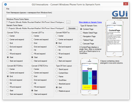
The conversion tool converts things like TextBlock to Label, TextBox to Entry, StackPanel to StackLayout etc, as well as converting properties like Margin to Padding and HorizontalAlignment to HorizontalOptions, with options for how you want to convert the alignments. There is also a settings screen that allows you to extend what the tool can convert, ignore and remove. This I found very useful as I’ll discuss shortly.
(Just a slight rant here; I really wish there was some kind of Xaml body to govern the standards for Xaml in the same way that the W3C does for web standards. Why oh why do we have all these inconsistencies. First it was WPF v Silverlight, then there was Windows Phone, followed by Windows RT and then Windows Universal Apps, and now we have another version of Xaml for Xamarin Forms. All of which have different names for the same control with differing properties and standards. This I feel really sucks. If Xaml were better managed and standardised like HTML we wouldn’t have to resort to having to convert from one to the other. Rant over.)
The first thing you will need is a Windows Phone project running in Visual Studio. If you have set up your Xamarin Forms solution to include Windows Phone then you can just use the existing Windows Phone project in your solution. What I did was created a folder called ‘Views’ and creating a new Windows Phone page from the new items templates and called it Prototype. You should then see the Designer alongside the Xaml like this.
Then you can set about designing your page using either the designer or the Xaml directly. I find editing the xaml directly is far easier and quicker. The best approach is to stick to the basic controls which you know will convert well. Sticking to Grid and StackPanel for the layout works well and TextBlock and Image work good for content. It’s best just to create something very simple first and then run it through the converter to see how it looks.
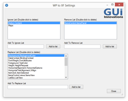
Open the converter and choose your Windows Phone xaml page you’ve just created by clicking the ellipse. The tool will then automatically suggest a name for the converted file in the same location. You can change this if you like but I just kept it the same as I’m just going to copy the converted xaml and paste it in my Xamarin Forms project. Then click ‘Generate’ to convert the Xaml to Xamarin Forms. You might also want to experiment a bit with the settings to see which works out best for you. I ended up adding a bunch of extra stuff to the replace list and deleted most of the stuff from the remove list. For example I didn’t want it to remove DataContext as I wanted to define some bindings in the Xaml so I deleted this from the remove list and added a replace for DataContext to BindingContext to the replace list. I also removed Height and Width from the remove list and added Height,HeightRequest and Width,WidthRequest to the replace list. Here are my modified settings.
- Rectangle,BoxView;
- HorizontalTextAlignment,XAlign;
- Height,HeightRequest;
- Width,WidthRequest;
- RowDefinition HeightRequest,RowDefinition Height;
- ColumnDefinition WidthRequest,ColumnDefinition Width;
- DataContext,BindingContext;
- ItemsControl,views:ItemsView;
Notice the last modification that converts an ItemsControl to my custom ItemsView, complete with the namespace prefix of views. I also had to convert Row/Column Definition Height/WidthRequest back to Height/Width as the converter converts them to Height/WidthRequest and in the case of Row/Column Definitions the correct properties are actually Height/Width.
Note: I discovered there appears to be a bug where anything you add to the remove list does not seem to get saved. I tracked down the location of the file where it gets saved to in
‘C:\Program Files (x86)\GUI Innovations Limited\Windows Phone Forms to Xamarin Forms\WP to XF.exe.config’
for the default settings, and custom user settings get saved in user.config, which I is located in
‘users\[username]\AppData\Local\ GUI_Innovations_Limited\…’
The trick here is to add a section for the Remove List to this file, because there won’t be one, which you can copy from ‘WP to XF.exe.config’. Then add in your entries in the format similar to ‘TextBox,Entry’. I’ve mentioned this issue to Pete so hopefully this will be fixed soon. It’s also worth pointing out that this is a beta product at the moment and any feedback from users will greatly help its development.
Once you have got the converted Xaml, copy this to your Xamarin Forms page. What I did was create a new page called Prototype that I set as the MainPage of my Xamarin Forms Application so that I can test out the results without running up the rest of my app in full. This allows me to quickly run up my prototype design before I incorporate it into the pages within my application.
One thing to bear in mind is the variations in font sizes and the way in which widths and heights are interpreted on different platforms. This is particularly evident between Windows Phone and iOS/Android. And since we are designing everything using the Windows Phone designer we definitely need to cater for this. We can do this using Styles, which are supported by both WP and XF Xaml. The trick here is to place anything that might vary within a style.
I didn’t want to clutter my Xaml page with Styles so I placed all these in the App.xaml of the Windows Phone project. I would have preferred to place them in a completely separate xaml file but there doesn’t seem to be a way to merge this with the application styles like you can with WPF (more to investigate here). You then need the equivalent styles in your Xamarin Forms project with the exact same keys, which you should place in the App.xaml file of your XF project.
You can initially use the conversion tool to convert the styles from WP to XF, so that things like Margin become Padding and TargetTypes like StackPanel become StackLayout. However, you will need to add in variations for the various platforms using OnPlatform for anything that will vary. What I did was initially set up Styles for the various Xamarin Forms Named Font Sizes of Default, Micro, Small, Medium and Large. These vary across platforms and you can’t use these directly within the WP Xaml so you will need a Style to represent them if you intend to use them. Here’s an example of the Styles I created for these for both WP and XF.
WP Styles:
<Style x:Key="textStyle" TargetType="TextBlock">
    <Setter Property="FontFamily" Value="Segoe WP Light" />
    <Setter Property="Foreground" Value="White" />
    <Setter Property="FontSize" Value="20" />
    <Setter Property="TextWrapping" Value="Wrap"/>
</Style>
<Style TargetType="TextBlock" BasedOn="{StaticResource textStyle}"/>

<Style x:Key="microTextStyle" TargetType="TextBlock" BasedOn="{StaticResource textStyle}">
    <Setter Property="FontSize" Value="16" />
</Style>
<Style x:Key="smallTextStyle" TargetType="TextBlock" BasedOn="{StaticResource textStyle}">
    <Setter Property="FontSize" Value="19" />
</Style>

<Style x:Key="mediumTextStyle" TargetType="TextBlock" BasedOn="{StaticResource textStyle}">
    <Setter Property="FontSize" Value="22" />
</Style>

<Style x:Key="largeTextStyle" TargetType="TextBlock" BasedOn="{StaticResource textStyle}">
    <Setter Property="FontSize" Value="32" />
</Style>
<Style x:Key="largeTextStyle1" TargetType="TextBlock" BasedOn="{StaticResource textStyle}">
    <Setter Property="FontSize" Value="48" />
</Style>
<Style x:Key="largeTextStyle2" TargetType="TextBlock" BasedOn="{StaticResource textStyle}">
    <Setter Property="FontSize" Value="56" />
</Style>
<Style x:Key="largeTextStyle3" TargetType="TextBlock" BasedOn="{StaticResource textStyle}">
    <Setter Property="FontSize" Value="100" />
</Style>
And here are the equivalent styles for Xamarin Forms with the named style names:
<Style x:Key="textStyle" TargetType="Label">
  <Setter Property="FontFamily" Value="SegoeWP-Light" />
  <Setter Property="TextColor" Value="White" />
  <Setter Property="FontSize" Value="Default" />
</Style>
<Style TargetType="Label" BasedOn="{StaticResource textStyle}" />

<Style x:Key="microTextStyle" TargetType="Label" BasedOn="{StaticResource textStyle}">
  <Setter Property="FontSize" Value="Micro" />
</Style>

<Style x:Key="smallTextStyle" TargetType="Label" BasedOn="{StaticResource textStyle}">
  <Setter Property="FontSize" Value="Small" />
</Style>

<Style x:Key="mediumTextStyle" TargetType="Label" BasedOn="{StaticResource textStyle}">
  <Setter Property="FontSize" Value="Medium" />
</Style>

<Style x:Key="largeTextStyle" TargetType="Label" BasedOn="{StaticResource textStyle}">
  <Setter Property="FontSize" Value="Large" />
</Style>
<Style x:Key="largeTextStyle1" TargetType="Label" BasedOn="{StaticResource textStyle}">
  <Setter Property="FontSize">
    <Setter.Value>
      <OnPlatform x:TypeArguments="x:Double" iOS="36" Android="36" WinPhone="48" />
    </Setter.Value>
  </Setter>
</Style>

<Style x:Key="largeTextStyle2" TargetType="Label" BasedOn="{StaticResource textStyle}">
  <Setter Property="FontSize">
    <Setter.Value>
      <OnPlatform x:TypeArguments="x:Double" iOS="42" Android="42" WinPhone="56" />
    </Setter.Value>
  </Setter>
</Style>

<Style x:Key="largeTextStyle3" TargetType="Label" BasedOn="{StaticResource textStyle}">
  <Setter Property="FontSize">
    <Setter.Value>
      <OnPlatform x:TypeArguments="x:Double" iOS="75" Android="75" WinPhone="100" />
    </Setter.Value>
  </Setter>
</Style>
Notice I have created 3 additional large text styles and defined their platform variations using OnPlatform.
There’s a little bit of work involved to define the styles initially, and you will probably end up maintaining these manually rather than using the conversion tool, but I think its good practice to place anything that varies in a separate Style. Your Xaml then becomes less tied to fixed sizes which make it more flexible. You also need to bear in mind that any Sizes for Heights, Widths or Margins will need to be roughly about 25% less on iOS and Android. If for example you define a Grid with a Height and Width of 100, it might look ok in the WP designer, but it will look much larger when you run it on the other platforms. Again factoring these out into Styles means that you catch these layout variations early and provide OnPlatform variations in a Style. This means your design is more likely to work against all platforms. Here’s a good example of a Style I created for variations in sizes for my page.
WP style
<Style x:Key="periodOuterStyle" TargetType="Grid">
    <Setter Property="Margin" Value="1" />
    <Setter Property="Width" Value="120" />
</Style>
Equivalent XF Style using OnPlatform:
<Style x:Key="periodOuterStyle" TargetType="Grid" BasedOn="{StaticResource gridStyle}">
  <Setter Property="Padding" Value="1" />
  <Setter Property ="WidthRequest">
    <Setter.Value>
      <OnPlatform x:TypeArguments="x:Double" iOS="90" Android="90" WinPhone="120" />
    </Setter.Value>
  </Setter>
</Style>
This means that your xaml shouldn’t actually have any hard coded font sizes or heights, instead referencing styles. It should just define the layout and content. This in many ways is similar to the approach used for Web pages using CSS.
Finally, my Piece De Resistance!
In WPF/WP it is possible to create design data which you can use to get a better visual representation in the designer of the data you will be working with. It also allows you to correctly define all the data bindings which will hook up to the view model of the page. I really wanted my converted Xaml to come compete with all these bindings and to be able to visually see what the result was in the actual designer. Design Data can be defined in your Xaml using the d:DataContext declaration. With this you can either define some design data as an xml file, or you can specify the actual type that the designer will create at design-time and populate with data. I was curious if it would be possible to use my existing Weather Service which my View Model requires as an injected parameter. I guess dependency injection is too much to ask really, but all I needed to do was to create a SampleData class that derives from my ViewModel with a parameterless constructor that creates my Weather Service and passes it to the base constructor like this:
    public class SampleData : AreaForecastReportViewModel
    {
        public SampleData() : base(new MountainWeatherService())
        {}
    }
And then define the d:DataContext on the root like this.
d:DataContext="{d:DesignInstance Type=designData:SampleData, IsDesignTimeCreatable=True }"
My service actually makes a call out to a real web service to return real data.
Is this really going to work in the designer at design-time??
Well initially, no it didn’t, until I discovered I small glitch in Visual Studio. It took me a while to figure this out, but if you unload and reload the Windows Phone project and then reopen the xaml it reloads the designer, creates the design data and bingo I can see the data in all its glory at design-time right in the designer.
This is real Data Binding at design time right within the designer. I have to say that this blew me away. And as I continue to modify my design and add more bindings to the view model the designer updates itself and shows the data as I go.
My design is now using a special custom font for the weather icons rather than individual icon images. This seems to be the way to go these days with the likes of FontAwesome for example. I managed to source the weather fonts from the same designer who created the icon images I’ve been using. This saves on image load time and allows the icon size and colour to be changed to whatever you like. Check out the Xamarin Forms Working with Fonts documentation if you are interested in taking this approach.
I have different backgrounds for each weather type so it can be challenging to get the balance right between the background images colours and the text and icon fonts. The designer is a great tool to help with this. I can easily switch the background image simply by choosing a different image in the Source property and instantly see the effect. This enabled me to play about with the opacity of overlays I am applying over some areas. This has saved me a lot of time and really helped tweak the design.
My workflow now consists of designing the layout in the WP designer; adding/modifying any styles in the WP and XF versions, converting the Xaml using the conversion tool, copying the output to my XF page and running up the App. Lets take a look at the full conversion of the Xaml from WP to XF.
<phone:PhoneApplicationPage
    x:Class="Silkweb.Mobile.MountainWeather.WinPhone.Views.Prototype"
    xmlns="http://schemas.microsoft.com/winfx/2006/xaml/presentation"
    xmlns:x="http://schemas.microsoft.com/winfx/2006/xaml"
    xmlns:phone="clr-namespace:Microsoft.Phone.Controls;assembly=Microsoft.Phone"
    xmlns:shell="clr-namespace:Microsoft.Phone.Shell;assembly=Microsoft.Phone"
    xmlns:d="http://schemas.microsoft.com/expression/blend/2008"
    xmlns:mc="http://schemas.openxmlformats.org/markup-compatibility/2006"
    xmlns:designData="clr-namespace:Silkweb.Mobile.MountainWeather.DesignData;assembly=Silkweb.Mobile.MountainWeather"
    xmlns:converters="clr-namespace:Silkweb.Mobile.MountainWeather.WinPhone.Converters"
    SupportedOrientations="Portrait" Orientation="Portrait"
    mc:Ignorable="d"
    shell:SystemTray.IsVisible="True"
    d:DataContext="{d:DesignInstance Type=designData:SampleData, IsDesignTimeCreatable=True }"
    Title="{Binding Title}" Margin="-1,0,1,0">

    <Grid>
        <Grid DataContext="{Binding Items[0]}">
            <Image Stretch="UniformToFill" Source="../Assets/Backgrounds/wsymbol_0011_light_snow_showers.jpeg" HorizontalAlignment="Center" />
            <Grid Background="#33000000" />
        </Grid>

        <Grid Style="{StaticResource pageStyle}">
            <Grid.Resources>
                <ResourceDictionary>
                    <DataTemplate x:Key="periodTemplate">
                        <Grid Style="{StaticResource periodOuterStyle}" VerticalAlignment="Top">
                            <Grid Background="{StaticResource periodColor}">
                                <StackPanel Style="{StaticResource periodStyle}">
                                    <TextBlock Text="{Binding Period}" Style="{StaticResource periodTextStyle}" />
                                    <TextBlock Text="{Binding WeatherCode.Glyph}"  Style="{StaticResource smallIconStyle}" />
                                    <Grid Style="{StaticResource periodDescriptionStyle}">
                                        <TextBlock Text="{Binding WeatherCode.Description}" Style="{StaticResource periodTextStyle}" />
                                    </Grid>
                                    <TextBlock Text="{Binding Probability}" Style="{StaticResource periodTextStyle}" VerticalAlignment="Bottom" />
                                </StackPanel>
                            </Grid>
                        </Grid>
                    </DataTemplate>

                    <DataTemplate x:Key="tabTemplate">
                        <Grid Style="{StaticResource tabOuterStyle}">
                            <Grid Style="{StaticResource tabStyle}">
                                <Grid Margin="10">
                                    <TextBlock Text="{Binding Date, StringFormat='\{0:ddd\}'}" Style="{StaticResource mediumTextStyle}" />
                                    <TextBlock Text="{Binding WeatherCode.Glyph}" VerticalAlignment="Center" Style="{StaticResource smallIconStyle}" />
                                </Grid>
                            </Grid>
                        </Grid>
                    </DataTemplate>
                </ResourceDictionary>
            </Grid.Resources>

            <Grid.RowDefinitions>
                <RowDefinition Height="*"/>
                <RowDefinition Height="Auto"/>
            </Grid.RowDefinitions>

            <Grid Grid.Row="0" Style="{StaticResource detailPanelStyle}" DataContext="{Binding Items[0]}">
                <Grid.RowDefinitions>
                    <RowDefinition Height="Auto"/>
                    <RowDefinition Height="Auto"/>
                    <RowDefinition Height="*"/>
                </Grid.RowDefinitions>

                <StackPanel>
                    <TextBlock Text="{Binding Title}" Style="{StaticResource largeTextStyle2}" />
                </StackPanel>

                <Grid Grid.Row="2">
                    <Grid.RowDefinitions>
                        <RowDefinition Height="Auto" />
                        <RowDefinition Height="Auto" />
                        <RowDefinition Height="20" />
                    </Grid.RowDefinitions>
                    <Grid.ColumnDefinitions>
                        <ColumnDefinition Width="*" />
                        <ColumnDefinition Width="*" />
                    </Grid.ColumnDefinitions>
                    <TextBlock Grid.Row="0" Grid.ColumnSpan="2" Text="{Binding Day}" Style="{StaticResource largeTextStyle}" />
                    <TextBlock Grid.Row="1" Grid.Column="0" Text="{Binding WeatherCode.Glyph}" Style="{StaticResource largeIconStyle}"
                               VerticalAlignment="Center" />
                    <StackPanel Grid.Row="1" Grid.Column="1">
                        <StackPanel  Orientation="Horizontal"
                                VerticalAlignment="Top" HorizontalAlignment="Center">
                            <TextBlock Text="{Binding Temperature}" Style="{StaticResource largeTextStyle3}" />
                            <StackPanel Margin="0,15,0,0">
                                <TextBlock Text="℃" Style="{StaticResource largeTextStyle1}" />
                            </StackPanel>
                        </StackPanel>

                        <TextBlock Text="{Binding WeatherCode.Description}" Style="{StaticResource mediumTextStyle2}" HorizontalAlignment="Center" />
                    </StackPanel>
                  </Grid>

                <StackPanel Grid.Row="2" Margin="0,0,0,-10"
                    Orientation="Horizontal" HorizontalAlignment="Center" VerticalAlignment="Bottom">
                    <TextBlock Text="." Style="{StaticResource largeTextStyle3}" />
                    <TextBlock Text="." Style="{StaticResource largeTextStyle3}" Opacity="0.5" />
                    <TextBlock Text="." Style="{StaticResource largeTextStyle3}" Opacity="0.5" />
                    <TextBlock Text="." Style="{StaticResource largeTextStyle3}" Opacity="0.5" />
                </StackPanel>
            </Grid>

            <Grid Grid.Row="1" VerticalAlignment="Bottom">
                <Grid.RowDefinitions>
                    <RowDefinition Height="*"/>
                    <RowDefinition Height="Auto"/>
                </Grid.RowDefinitions>

                <ScrollViewer Grid.Row="0" Style="{StaticResource scrollViewStyle}" Margin="0,0,0,30" DataContext="{Binding Items[0]}">
                    <ItemsControl ItemsSource="{Binding WeatherPeriods}" ItemTemplate="{StaticResource periodTemplate}" Style="{StaticResource itemsControlStyle}" />
                </ScrollViewer>

                <ScrollViewer Grid.Row="1" VerticalAlignment="Bottom" Style="{StaticResource tabScrollViewStyle}">
                    <ItemsControl ItemsSource="{Binding Items}" ItemTemplate="{StaticResource tabTemplate}" Style="{StaticResource itemsControlStyle}" />
                </ScrollViewer>
            </Grid>
        </Grid>
    </Grid>
</phone:PhoneApplicationPage>
And here is the Xaml converted to Xamarin Forms:
<?xml version="1.0" encoding="utf-8" ?>
<ContentPage xmlns="http://xamarin.com/schemas/2014/forms"
             xmlns:x="http://schemas.microsoft.com/winfx/2009/xaml"
             xmlns:views="clr-namespace:Silkweb.Mobile.Core.Views;assembly=Silkweb.Mobile.Core"
             x:Class="Silkweb.Mobile.MountainWeather.Views.Prototype"
             xmlns:d="http://schemas.microsoft.com/expression/blend/2008"
             xmlns:mc="http://schemas.openxmlformats.org/markup-compatibility/2006"
             xmlns:viewModels="clr-namespace:Silkweb.Mobile.MountainWeather.ViewModels;assembly=Silkweb.Mobile.MountainWeather"
             xmlns:designData="clr-namespace:Silkweb.Mobile.MountainWeather.DesignData;assembly=Silkweb.Mobile.MountainWeather"
             xmlns:sys="clr-namespace:System;assembly=System.Runtime"
             xmlns:views1="clr-namespace:Silkweb.Mobile.MountainWeather.Views;assembly=Silkweb.Mobile.MountainWeather"
             mc:Ignorable="d"
             d:DataContext="{d:DesignInstance Type=viewModels:AreaForecastReportViewModel, IsDesignTimeCreatable=False}">

  <Grid>
    <Grid BindingContext="{Binding Items[0]}">
      <Image Aspect="AspectFill" Source="{Binding BackgroundImage}" />
      <Grid BackgroundColor="#33000000" />
    </Grid>

    <Grid  Style="{StaticResource pageStyle}">
      <Grid.Resources>
        <ResourceDictionary>
          <DataTemplate x:Key="periodTemplate">
            <Grid Style="{StaticResource periodOuterStyle}" VerticalOptions="Start">
              <Grid BackgroundColor="{StaticResource periodColor}">
                <StackLayout Style="{StaticResource periodStyle}">
                  <Label Text="{Binding Period}" Style="{StaticResource periodTextStyle}" />
                  <Label Text="{Binding WeatherCode.Glyph}"  Style="{StaticResource smallIconStyle}" />
                  <Grid Style="{StaticResource periodDescriptionStyle}">
                    <Label Text="{Binding WeatherCode.Description}" Style="{StaticResource periodTextStyle}" />
                  </Grid>
                  <Label Text="{Binding Probability}" Style="{StaticResource periodTextStyle}" VerticalOptions="End" />
                </StackLayout>
              </Grid>
            </Grid>
          </DataTemplate>

          <DataTemplate x:Key="tabTemplate">
            <Grid Style="{StaticResource tabOuterStyle}">
              <Grid Style="{StaticResource tabStyle}">
                <Grid >
                  <Label Text="{Binding Date, StringFormat='\{0:ddd\}'}" Style="{StaticResource mediumTextStyle}" />
                  <Label Text="{Binding WeatherCode.Glyph}" VerticalOptions="Center" Style="{StaticResource smallIconStyle}" />
                </Grid>
              </Grid>
            </Grid>
          </DataTemplate>
        </ResourceDictionary>
      </Grid.Resources>

      <Grid.RowDefinitions>
        <RowDefinition Height="*"/>
        <RowDefinition Height="Auto"/>
      </Grid.RowDefinitions>

      <Grid Grid.Row="0" Padding="5,0,5,0" Style="{StaticResource detailPanelStyle}" BindingContext="{Binding Items[0]}">
        <Grid.RowDefinitions>
          <RowDefinition Height="Auto"/>
          <RowDefinition Height="Auto"/>
          <RowDefinition Height="*"/>
        </Grid.RowDefinitions>

        <StackLayout>
          <Label Text="{Binding Title}" Style="{StaticResource largeTextStyle2}" />
        </StackLayout>

        <Grid Grid.Row="2">
          <Grid.RowDefinitions>
            <RowDefinition Height="Auto" />
            <RowDefinition Height="Auto" />
            <RowDefinition Height="20" />
          </Grid.RowDefinitions>
          <Grid.ColumnDefinitions>
            <ColumnDefinition Width="*" />
            <ColumnDefinition Width="*" />
          </Grid.ColumnDefinitions>
          <Label Grid.Row="0" Grid.ColumnSpan="2" Text="{Binding Day}" Style="{StaticResource largeTextStyle}" />
          <Label Grid.Row="1" Grid.Column="0" Text="{Binding WeatherCode.Glyph}" Style="{StaticResource largeIconStyle}"
                     VerticalOptions="Center" />
          <StackLayout Grid.Row="1" Grid.Column="1">
            <StackLayout  Orientation="Horizontal"
                    VerticalOptions="Start" HorizontalOptions="Center">
              <Label Text="{Binding Temperature}" Style="{StaticResource largeTextStyle3}" />
              <StackLayout Padding="0,15,0,0">
                <Label Text="℃" Style="{StaticResource largeTextStyle1}" />
              </StackLayout>
            </StackLayout>

            <Label Text="{Binding WeatherCode.Description}" Style="{StaticResource mediumTextStyle2}"
                       HorizontalOptions="Center" />
          </StackLayout>
        </Grid>

        <StackLayout Grid.Row="2" Padding="0,0,0,-10"
            Orientation="Horizontal" HorizontalOptions="Center" VerticalOptions="End">
          <Label Text="." Style="{StaticResource largeTextStyle3}" />
          <Label Text="." Style="{StaticResource largeTextStyle3}" Opacity="0.5" />
          <Label Text="." Style="{StaticResource largeTextStyle3}" Opacity="0.5" />
          <Label Text="." Style="{StaticResource largeTextStyle3}" Opacity="0.5" />
        </StackLayout>

      </Grid>

      <Grid Grid.Row="1" VerticalOptions="End">
        <Grid.RowDefinitions>
          <RowDefinition Height="*"/>
          <RowDefinition Height="Auto"/>
        </Grid.RowDefinitions>

        <ScrollView Grid.Row="0" Style="{StaticResource scrollViewStyle}" Padding="0,0,0,30" BindingContext="{Binding Items[0]}">
          <views:ItemsView ItemsSource="{Binding WeatherPeriods}" ItemTemplate="{StaticResource periodTemplate}" Style="{StaticResource itemsControlStyle}" />
        </ScrollView>

        <ScrollView Grid.Row="1" VerticalOptions="End" Style="{StaticResource tabScrollViewStyle}">
          <views:ItemsView ItemsSource="{Binding Items}" ItemTemplate="{StaticResource tabTemplate}" Style="{StaticResource itemsControlStyle}" />
        </ScrollView>
      </Grid>
    </Grid>
  </Grid>
</ContentPage>
As you can see the conversion is seamless with everything converted to the appropriate XF equivalent, with the exception of the background image that I hard coded in the WP version so I could test how things looked with different backgrounds. Also notice the use of the Styles in both versions, which abstracts away all of the platform variations.
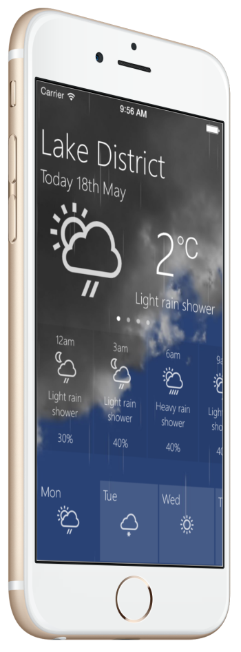
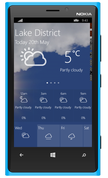
Let’s see how this looks on each platform.
You might notice that I have a swipe carousel in the top part of the screen. This is evident by the familiar dots that indicate the number of screens you can scroll to, just like you get on iOS. I haven’t yet figured out the best solution to this (I will be exploring this in a later post), but it does really matter at this stage. I can still create the design to give this effect, by simply using a series of periods with opacity, and it is clear that there should be 3 more parts that you can swipe in to view. I can then simply switch in the Xaml for each part in the designer to see how it looks. There is more work still required on this screen but it feels to be heading in the right direction. The thing is I now have a visual designer that I can use to modify and tweak my design until I am happy with it.
I’d finally really like to thank Pete Vickers for this brilliant tool. It really has opened up a whole new world for me. I would really like to see this tool adopted more by the Xamarin Forms community and help make it something we can really benefit from. That said, will there ever be a real Xamarin Forms designer from Xamarin, who knows?


