
- Part 1 : Introduction
- Part 2 : Getting Started
- Part 3 : How to use Xamarin Forms with Visual Studio without the Business Edition
- Part 4 : Application Resources
- Part 5 : Dependency Injection
- Part 6 : View Model First Navigation
- Part 7 : Unit Testing
- Part 8 : Consuming a RESTful Web Service
- Part 9 : Working with Alerts and Dialogs
- Part 10 : Designing and Developing the User Interface
- Part 11 : Updating to Xamarin Forms 1.3
- Part 12 : Extending the User Interface
In this post I am going to design and develop the User Interface for my Mountain Weather App. There is a lot to cover so I am going to keep things quite distilled.
At the moment when you select a mountain area my app really isn’t showing much information other than the forecast summary.

There is quite a lot of forecast data that is supplied in the data feed from the Met Office. The data covers a 5-day forecast, which is represented by my ForecastReport class. This contains 2 detailed forecasts for the first 2 days and 3 overviews for the other days. It also contains Issued and Validity dates, location details and a general forecast overview. The Forecast class represents each detailed forecast. Day one provides a series of weather periods throughout the day known as WxPeriods, which represent a 3-hour period during the day. Each WxPeriod has a weather code for the type of weather for that period. The definitions of these weather codes are available from the met office here. I have encapsulated these in the WeatherCodes class, which exposes them as a List of WeatherCode instances. The forecast data also includes forecast details for Visibility, Wind and Temperature. The model for this data looks like this:

The challenge therefore is to display all this information to the user concisely so that it is easy to read and navigate. One weather app that does this very well is the BBC weather app, which shows forecast information for none mountain locations over a 10-day period as a tabbed layout shown below.


As you can see you can scroll across the main display to view more detail for periods during the day. I really like this so it is going to be the inspiration for my design and layout.
I however have more information I need to display so I need to come up with a layout that can display it. There are some really good design tools out there today for wire framing your designs like Balsamiq, which also provides widgets for mobile phones. Personally I’m not a great fan of these tools because I find they distract me and I end up wasting more time at the mercy of them. For me I find the best approach is good old pen and paper. I can sketch out a rough design much quicker than any of these fancy tools, and at the end of the day all we want to do is sketch out some rough ideas. I generally find I can refine this later in the actual Xaml layouts. So without further ado, here is my grand design.

There is quite a lot going on here but I think the sketch clearly conveys this. The layout if fairly complex and is made up of a tabbed layout that has a number of scrollable sections.
First of all I need to create my ViewModels to represent this. I already know from my Model that I have 3 varying types of forecast. An overview which just has a textural summary, a forecast with more details such a visibility, wind, fog and temperature and a detailed forecast which includes all the above plus the WxPeriods mentioned earlier. I also need each of these forecast to be selectable, you will see why this is later. This suggests I should have a hierarchy to represent this, where each derived class adds more forecast details. Here is a class diagram of my View Models showing this.

Here I have created a SelectableViewModel, which implements ISelectable and then created a WeatherDayViewModel to introduce the common properties for all the forecasts. I then have derived OutlookViewModel for the outlook forecasts and the ForecastViewModel for the main detailed forecasts. Notice this has a WeatherPeriods property, which is a collection of WeatherPeriodViewModels. The ForecastReportViewModel then has a collection of SelectableViewModels. This will contain the 5 view models for each forecast day. Now when I create the ForecastReportViewModel I need to load the forecast data. I do this by calling the following LoadForecast method.
        public async void LoadForecast()
        {
            IsBusy = true;
            _forecastReport = null;

            try
            {
                _forecastReport = await _mountainWeatherService.GetAreaForecast(_location.Id);

                if (_forecastReport == null)
                    return;

                var date = _forecastReport.ForecastDay0.Date;

                Items = new List<SelectableViewModel>
                {
                        new ForecastViewModel(_forecastReport.ForecastDay0) { IssuedDate = _forecastReport.IssueDateTime },
                        new ForecastViewModel(_forecastReport.ForecastDay1) { IssuedDate = _forecastReport.IssueDateTime },
                        new OutlookViewModel(_forecastReport.OutlookDay2, date.AddDays(2)) { IssuedDate = _forecastReport.IssueDateTime },
                        new OutlookViewModel(_forecastReport.OutlookDay3, date.AddDays(3)) { IssuedDate = _forecastReport.IssueDateTime },
                        new OutlookViewModel(_forecastReport.OutlookDay4, date.AddDays(4)) { IssuedDate = _forecastReport.IssueDateTime }
                };
            }
            catch (Exception ex)
            {
                _error = ex;
                if (_isVisible)
                    ShowError();
            }
            finally
            {
                IsBusy = false;
            }
        }
I get the data from the service as before and then set the Forecast day Items to a List of ViewModels for each of the forecast days. The first two being ForecastViewModel and the remaining 3 are OutlookViewModels. I am passing the forecast model to the 2 ForecastViewModels and also incrementing the date for each of the other days. I have also added an IsBusy property, which I set whilst loading the data so I can bind this to an ActivityIndicator in my view. Now that I have my view models I need to focus on the view.
The view needs to be a tabbed view that will allow the user to select each of the forecast days. However I want this to look similar to the one in the BBC App. I started out trying the TabbedPage that comes with Xamarin Forms before discovering that this is actually very limiting in being able to design and style it exactly how I wanted it. Further more the Xamarin Forms implementation is designed to use the native tabbed controls for each of the platforms, all of which look very different. In this case I actually want it to look exactly the same on each platform. So I needed to come up with something different.
Thinking about this I realised that there is a common control that I need for two aspects of my view. Both the scrolling Periods at the top and the scrolling Days at the bottom require a scrollable Items View. I thought ListView might be a good candidate for this but then discovered that there is no way to set this to scroll horizontally. So I then turned to StackLayout. But StackLayout doesn’t support binding to a list of items, so I created a ItemsView which exposes an ItemsSource bindable property that allows me to bind to my list of items. I have also provided bindable properties for ItemTemplate of type DataTemplate and a SelectedItem propery which gets set to the selected item. This extends ScrollView and adds a StackLayout, which it adds the Items to when the ItemsSource is set. Here is this code for this:
namespace Silkweb.Mobile.Core.Views
{
    public partial class ItemsView : ScrollView
    {
        private readonly ICommand _selectedCommand;

        public ItemsView()
        {
            InitializeComponent();

            _selectedCommand = new Command<object>( item =>  SelectedItem = item );
        }

        public event EventHandler SelectedItemChanged;

        public static readonly BindableProperty ItemsSourceProperty =
            BindableProperty.Create<ItemsView,IList>(p => p.ItemsSource, default(IList), BindingMode.TwoWay, null, ItemsSourceChanged);

        public IList ItemsSource
        {
            get { return (IList)GetValue(ItemsSourceProperty); }
            set { SetValue(ItemsSourceProperty, value); }
        }

        public static readonly BindableProperty SelectedItemProperty =
            BindableProperty.Create<ItemsView,object>(p => p.SelectedItem, default(object), BindingMode.TwoWay, null, OnSelectedItemChanged);

        public object SelectedItem
        {
            get { return (object)GetValue(SelectedItemProperty); }
            set { SetValue(SelectedItemProperty, value); }
        }

        public static readonly BindableProperty ItemTemplateProperty =
            BindableProperty.Create<ItemsView,DataTemplate>(p => p.ItemTemplate, default(DataTemplate));

        public DataTemplate ItemTemplate
        {
            get { return (DataTemplate)GetValue(ItemTemplateProperty); }
            set { SetValue(ItemTemplateProperty, value); }
        }

        private static void ItemsSourceChanged(BindableObject bindable, IList oldValue, IList newValue)
        {
            var itemsLayout = (ItemsView)bindable;
            itemsLayout.SetItems();
        }

        private void SetItems()
        {
            stackLayout.Children.Clear();

            if (ItemsSource == null)
                return;

            foreach (var item in ItemsSource)
                stackLayout.Children.Add(GetItemView(item));

            SelectedItem = ItemsSource.Cast<object>().FirstOrDefault();
        }

        private View GetItemView(object item)
        {
            var content = ItemTemplate.CreateContent();
            var view = content as View;
            view.BindingContext = item;

            view.GestureRecognizers.Add(new TapGestureRecognizer
                {
                    Command = _selectedCommand,
                    CommandParameter = item as object
                });

            return view;
        }

        private static void OnSelectedItemChanged(BindableObject bindable, object oldValue, object newValue)
        {
            var itemsView = (ItemsView)bindable;

            if (newValue == oldValue)
                return;

            var items = itemsView.ItemsSource.OfType<ISelectable>();

            foreach (var item in items)
                item.IsSelected = item == newValue;

            var handler = itemsView.SelectedItemChanged;
            if (handler != null)
                handler(itemsView, EventArgs.Empty);
        }
    }
}
And the xaml looks like this:
<?xml version="1.0" encoding="UTF-8"?>
<ScrollView
	xmlns="http://xamarin.com/schemas/2014/forms"
	xmlns:x="http://schemas.microsoft.com/winfx/2009/xaml"
	x:Class="Silkweb.Mobile.Core.Views.ItemsView"
	Orientation="Horizontal">

	<StackLayout x:Name="stackLayout" Orientation="Horizontal" Padding="0" Spacing="0" />

</ScrollView>
Notice the GetItemView, which creates the content from the ItemTemplate by calling CreateContent. This also adds a TapGestureRecognizer to the content and sets it’s command so that we can handle the user tapping on the item. The handler for the command execution iterates through the ItemsSource for types that support ISelectable and set the IsSelected property to true or false depending on whether it is the selected item. Now that I have this I can create a View for my ForecastViewModel to bind to. I call this ForecastView and this is going to display the WxPeriods as a horizontal scrolling panel and the forecast details below.
One thing I need however for my WxPeriods is an image to represent each type of weather code. I thought this was going to be quite a challenge because I needed a weather image for all 30 codes and then need to map each one to each code. After a bit of googling I discovered this site by Mike Afford who turns out to be the same guy that designed the icons for the BBC, but now provides 3 weather icon sets that look remarkably similar but are available for commercial use. Even better he has also provided a direct mapping to the Met Office weather codes to the images in the icon sets. Wow, job done! I have therefore provided this mapping in the WeatherCodes class which maps the weather codes, descriptions and icon image names. I originally tried using embedded resources for these images to avoid duplicating them in each target platform project, but I discovered real problems with this in that the images didn’t get correctly loaded when using ImageSource.FromImage, so I am using Local Images and have copied the iconsets in to each of the target platform projects. More on this can be found on the Xamarin Forms site here.
In my ForecastView I am using the ItemsView and defined a DataTemplate for my WxPeriods. The ItemsView ItemSource is bound to my WeatherPeriods collection and the ItemTemplate is set to the DataTemplate defined in the Recources. I have also fleshed out the rest of the details using Labels and defined the Layout using a StackLayouts.
<?xml version="1.0" encoding="utf-8"?>
<ContentView
  xmlns="http://xamarin.com/schemas/2014/forms"
  xmlns:x="http://schemas.microsoft.com/winfx/2009/xaml"
  xmlns:cv="clr-namespace:Silkweb.Mobile.Core.Views;assembly=Silkweb.Mobile.Core"
  xmlns:ex="clr-namespace:Silkweb.Mobile.Core.Extensions;assembly=Silkweb.Mobile.Core"
  xmlns:cc="clr-namespace:Silkweb.Mobile.Core.Converters;assembly=Silkweb.Mobile.Core"
  x:Class="Silkweb.Mobile.MountainWeather.Views.ForecastView"
  IsClippedToBounds="true">

	<ContentView.Resources>
		<ResourceDictionary>
			<cc:NullToVisibilityConverter x:Key="nullToVisibilityConverter" />
			<DataTemplate x:Key="itemItemplate">
				<Grid WidthRequest="100">
					<StackLayout Padding="5" Spacing="0">
						<Label Text="{Binding Period}" Font="Micro" VerticalOptions="Start" HorizontalOptions="Center" TextColor="{ex:ApplicationResource textColor}" />
						<Image Source="{Binding Icon}" VerticalOptions="Start" HorizontalOptions="Center" WidthRequest="48" HeightRequest="48" />
						<Label Text="{Binding Weather}" Font="Micro" VerticalOptions="Start" HorizontalOptions="Center" TextColor="{ex:ApplicationResource textColor}" />
						<StackLayout Padding="0,5,0,0" Spacing="0">
							<Label Text="{Binding Probability}" Font="Micro" VerticalOptions="Start" HorizontalOptions="Center" TextColor="{ex:ApplicationResource textColor}" />
						</StackLayout>
					</StackLayout>
				</Grid>
			</DataTemplate>
		</ResourceDictionary>
	</ContentView.Resources>
	<StackLayout Spacing="0" Padding="5">
		<StackLayout Spacing="0">
			<Label Text="{Binding Title}" Font="Bold, Large" TextColor="{ex:ApplicationResource accentColor}" />
			<Label Text="{Binding IssuedBy}" Font="Micro" TextColor="{ex:ApplicationResource textColor}" />
		</StackLayout>
		<ScrollView Orientation="Vertical" IsClippedToBounds="true">
			<StackLayout Spacing="0">

				<cv:ItemsView IsClippedToBounds="true" ItemsSource="{Binding WeatherPeriods}" ItemTemplate="{StaticResource itemItemplate}"
					IsVisible="{Binding WeatherPeriods, Converter={StaticResource nullToVisibilityConverter}}" />

				<StackLayout VerticalOptions="FillAndExpand" Spacing="10">
					<StackLayout Spacing="0">
						<Label Text="Summary" Font="Bold, Medium" TextColor="{ex:ApplicationResource accentColor}" />
						<Label Text="{Binding Weather}" Font="Small" TextColor="{ex:ApplicationResource textColor}" />
					</StackLayout>
					<StackLayout Spacing="0">
						<Label Text="Visibility" Font="Bold, Medium" TextColor="{ex:ApplicationResource accentColor}" />
						<Label Text="{Binding Forecast.Visibility}" Font="Small" TextColor="{ex:ApplicationResource textColor}" />
					</StackLayout>
					<StackLayout Spacing="0">
						<Label Text="Hill Fog" Font="Bold, Medium" TextColor="{ex:ApplicationResource accentColor}" />
						<Label Text="{Binding Forecast.HillFog}" Font="Small" TextColor="{ex:ApplicationResource textColor}" />
					</StackLayout>
					<StackLayout Spacing="0">
						<Label Text="{Binding Forecast.MaxWindLevel, StringFormat='Max wind above {0}'}" Font="Bold, Medium" TextColor="{ex:ApplicationResource accentColor}" />
						<Label Text="{Binding Forecast.MaxWind}" Font="Small" TextColor="{ex:ApplicationResource textColor}" />
					</StackLayout>
					<StackLayout Spacing="5">
						<Label Text="Temperature" Font="Bold, Medium" TextColor="{ex:ApplicationResource accentColor}" />
						<StackLayout Spacing="0">
							<Label Text="Freezing level:" Font="Bold, Small" TextColor="{ex:ApplicationResource accentColor}" />
							<Label Text="{Binding Forecast.FreezingLevel}" Font="Small" TextColor="{ex:ApplicationResource textColor}" />
						</StackLayout>
						<StackLayout Spacing="0">
							<Label Text="Above 900m:" Font="Bold, Small" TextColor="{ex:ApplicationResource accentColor}" />
							<Label Text="{Binding Forecast.TempHighLevel}" Font="Small" TextColor="{ex:ApplicationResource textColor}" />
						</StackLayout>
						<StackLayout Spacing="0">
							<Label Text="Low level:" Font="Bold, Small" TextColor="{ex:ApplicationResource accentColor}" />
							<Label Text="{Binding Forecast.TempLowLevel}" Font="Small" TextColor="{ex:ApplicationResource textColor}" />
						</StackLayout>
					</StackLayout>
				</StackLayout>
			</StackLayout>
		</ScrollView>
	</StackLayout>
</ContentView>
Also note here that I have defined some colors in my Application Resources which I am referencing using the ex:ApplicationResource markup extension. More on that here. These are defined in my MountainWeatherApp.xaml like this.
	<core:App.Resources>
		<ResourceDictionary>
      		<converters:ImageSourceConverter x:Key="imageSourceConverter" />
      		<Color x:Key="backgroundColor">#3d78a2</Color>
      		<Color x:Key="highlightColor">#1AFFFFFF</Color>
      		<Color x:Key="textColor">White</Color>
      		<Color x:Key="accentColor">White</Color>
		</ResourceDictionary>
	</core:App.Resources>
Also note that I am binding the IsVisible property of the ItemView to the WeatherPeriods using a NullToVisibilityConverter so that this doesn’t get displayed for the 2nd forecast day which doesn’t contain any weather periods. I have also created an OutlookView for the OutlookViewModels which is a very simplified view which I won’t show here.
Now let’s focus on the TabbedView I need to bring all this together. I am going to reuse the ItemsView I have created already and create a TabbedView control that will extend Grid. This will add two RowDefinitions to the Grid. In the first row I place a TemplateContentView (more in this in a moment) and in the other row I place my ItemsView. In the code I expose BindableProperties for ItemsSource and a TemplateSector, which is of type TemplateSector. I have taken both the TemplateSector and the TemplateContentView from the excellent Xamarin Forms Labs project and modified them slightly. This project provides some really great stuff, but I don’t want to include the entire project as there is also a lot of stuff in there I don’t want and also don’t really like either. I will do another post on this later. Essentially though this allows me to define a placeholder for the content that is going to get displayed for the selected item. The template selector is used to select the appropriate DataTemplate for the data type of the selected item. Here is the code and xaml for my TabbedView.
namespace Silkweb.Mobile.Core.Views
{
    public partial class TabbedView : Grid
    {
	public TabbedView ()
	{
	    InitializeComponent ();
            items.SelectedItemChanged += HandleSelectedItemChanged;
	}

        private void HandleSelectedItemChanged(object sender, EventArgs e)
        {
            content.BindingContext = items.SelectedItem;
        }

        public static readonly BindableProperty ItemsSourceProperty =
            BindableProperty.Create<TabbedView, IList>(p => p.ItemsSource, default(IList), BindingMode.TwoWay, null, ItemsSourceChanged);

        public IList ItemsSource
        {
            get { return (IList)GetValue(ItemsSourceProperty); }
            set { SetValue(ItemsSourceProperty, value); }
        }

        public static readonly BindableProperty ItemTemplateProperty =
            BindableProperty.Create<TabbedView, DataTemplate>(p => p.ItemTemplate, default(DataTemplate), BindingMode.TwoWay, null, ItemTemplateChanged);

        public DataTemplate ItemTemplate
        {
            get { return (DataTemplate)GetValue(ItemTemplateProperty); }
            set { SetValue(ItemTemplateProperty, value); }
        }

        public static readonly BindableProperty TemplateSelectorProperty =
            BindableProperty.Create<TabbedView,TemplateSelector>(p => p.TemplateSelector, default(TemplateSelector), BindingMode.Default, null, TemplateSelectorChanged);

        public TemplateSelector TemplateSelector
        {
            get { return (TemplateSelector)GetValue(TemplateSelectorProperty); }
            set { SetValue(TemplateSelectorProperty, value); }
        }

        private static void ItemsSourceChanged(BindableObject bindable, IList oldValue, IList newValue)
        {
            var view = (TabbedView)bindable;
            view.SetItemsSource(newValue);
        }

        private void SetItemsSource(IList itemsSource)
        {
            items.ItemsSource = itemsSource;
        }

        private static void ItemTemplateChanged(BindableObject bindable, DataTemplate oldValue, DataTemplate newValue)
        {
            var view = (TabbedView)bindable;
            view.SetItemTemplate(newValue);
        }

        private void SetItemTemplate(DataTemplate itemTemplate)
        {
            items.ItemTemplate = itemTemplate;
        }

        private static void TemplateSelectorChanged(BindableObject bindable, TemplateSelector oldValue, TemplateSelector newValue)
        {
            var view = (TabbedView)bindable;
            view.SetTemplateSelector(newValue);
        }

        private void SetTemplateSelector(TemplateSelector templateSelector)
        {
            content.TemplateSelector = templateSelector;
        }
	}
}
<?xml version="1.0" encoding="UTF-8"?>
<Grid
	xmlns="http://xamarin.com/schemas/2014/forms"
	xmlns:x="http://schemas.microsoft.com/winfx/2009/xaml"
	x:Class="Silkweb.Mobile.Core.Views.TabbedView"
    xmlns:cv="clr-namespace:Silkweb.Mobile.Core.Views;assembly=Silkweb.Mobile.Core">

	<Grid.RowDefinitions>
		<RowDefinition Height="*" />
		<RowDefinition Height="Auto" />
	</Grid.RowDefinitions>
	<Grid.ColumnDefinitions>
		<ColumnDefinition Width="*" />
	</Grid.ColumnDefinitions>

	<cv:TemplateContentView Grid.Row="0" x:Name="content" />
	<cv:ItemsView Grid.Row="1" x:Name="items" />

</Grid>
The content change is handled by the SelectedItemChanged handler for the ItemsView. This simply sets the BindingContext of the TemplateContentView to the SelectedItem of the ItemsView, essentially hooking them together. The rest of the code is simply forwarding on the values set on the BindableProperies to the TemplateContentView and the ItemsView. Now lets use this.
I’ve created a ForecastReportView where I can add my TabbedView. I also need to define a TemplateSector, which contains the DataTemplates for each type of SelectableViewModel. And I also need to define a DataTemplate for the Tab items. Here is the entire Xaml for this.
<?xml version="1.0" encoding="utf-8"?>
<ContentPage xmlns="http://xamarin.com/schemas/2014/forms" xmlns:x="http://schemas.microsoft.com/winfx/2009/xaml" x:Class="Silkweb.Mobile.MountainWeather.Views.ForecastReportView" xmlns:b="clr-namespace:Xamarin.Behaviors;assembly=Xamarin.Behaviors" xmlns:cv="clr-namespace:Silkweb.Mobile.Core.Views;assembly=Silkweb.Mobile.Core" xmlns:ex="clr-namespace:Silkweb.Mobile.Core.Extensions;assembly=Silkweb.Mobile.Core" xmlns:cc="clr-namespace:Silkweb.Mobile.Core.Converters;assembly=Silkweb.Mobile.Core" xmlns:v="clr-namespace:Silkweb.Mobile.MountainWeather.Views;assembly=Silkweb.Mobile.MountainWeather" xmlns:vm="clr-namespace:Silkweb.Mobile.MountainWeather.ViewModels;assembly=Silkweb.Mobile.MountainWeather" xmlns:c="clr-namespace:Silkweb.Mobile.MountainWeather.Converters;assembly=Silkweb.Mobile.MountainWeather" Title="{Binding Title}" BackgroundColor="{ex:ApplicationResource backgroundColor}">
	<ContentPage.Resources>
		<ResourceDictionary>
			<c:SelectedColorConverter x:Key="selectedColorConverter" SelectedColor="Transparent" UnSelectedColor="{ex:ApplicationResource highlightColor}" />
			<cc:DateTimeToStringConverter x:Key="dateTimeConverter" />
			<cv:TemplateSelector x:Key="templateSelector">
				<cv:TemplateSelector.Templates>
					<cv:DataTemplateWrapper IsDefault="true" x:TypeArguments="vm:ForecastViewModel">
						<cv:DataTemplateWrapper.WrappedTemplate>
							<DataTemplate>
								<v:ForecastView />
							</DataTemplate>
						</cv:DataTemplateWrapper.WrappedTemplate>
					</cv:DataTemplateWrapper>
					<cv:DataTemplateWrapper x:TypeArguments="vm:OutlookViewModel">
						<cv:DataTemplateWrapper.WrappedTemplate>
							<DataTemplate>
								<v:OutlookView />
							</DataTemplate>
						</cv:DataTemplateWrapper.WrappedTemplate>
					</cv:DataTemplateWrapper>
				</cv:TemplateSelector.Templates>
			</cv:TemplateSelector>
			<DataTemplate x:Key="itemTemplate">
				<Grid Padding="1">
					<Grid WidthRequest="100" HeightRequest="100" BackgroundColor="{Binding IsSelected, Converter={StaticResource selectedColorConverter}}">
						<StackLayout Padding="5" Spacing="0">
							<Label Text="{Binding Date, StringFormat='{0:ddd}'}" Font="Mirco" VerticalOptions="Start" HorizontalOptions="Start" TextColor="{ex:ApplicationResource textColor}" />
							<Label Text="{Binding Date, Converter={StaticResource dateTimeConverter}, ConverterParameter='d{0} MMM'}" Font="Mirco" VerticalOptions="Start" HorizontalOptions="Start" TextColor="{ex:ApplicationResource textColor}" />
							<Image Source="{Binding Icon}" VerticalOptions="Start" HorizontalOptions="Center" WidthRequest="48" HeightRequest="48" />
						</StackLayout>
					</Grid>
				</Grid>
			</DataTemplate>
		</ResourceDictionary>
	</ContentPage.Resources>
	<Grid>
		<Grid.RowDefinitions>
			<RowDefinition Height="*" />
		</Grid.RowDefinitions>
		<Grid.ColumnDefinitions>
			<ColumnDefinition Width="*" />
		</Grid.ColumnDefinitions>
		<cv:TabbedView ItemsSource="{Binding Items}" ItemTemplate="{StaticResource itemTemplate}" TemplateSelector="{StaticResource templateSelector}" />
		<ActivityIndicator IsRunning="{Binding IsBusy}" HorizontalOptions="Center" VerticalOptions="Center" />
	</Grid>
</ContentPage>
Notice I am binding the BackgroundColor in the itemTemplate to the IsSelected property with a SelectedColorConverter that allows me to define the colours for when the item is selected and unselected. This makes the tabs switch colour as you tap them.
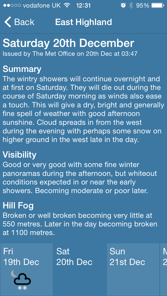
Now let’s run the app and see how it looks:

Wow! That’s pretty cool. And it looks like we have some snow just in time for Christmas 🙂
Now let’s try scrolling the weather periods and scrolling down the page.


Awesome. And now lets try scrolling the tabs and selecting some other tabs.


Excellent. This works exactly as I wanted it 🙂
I have covered a lot of ground in this post but I have also had to skip over some things and kept things distilled.
 Adventures in Xamarin Forms
Thanks for blog post, wanted to test design on all three platforms and downloaded project from github, but it doesn’t compile some converters missing (ImageSourceConverter, ViewModelToViewConverter… + images in drawable in android and some other stuff).
LikeLike
Great post. Wanted to test design (how does it looks like on al three platforms), but project on github doesn’t compile. Some files missing (converters…) and resources for android (drawables…)
LikeLike
Hi,
Some of the files hadn’t been added and committed correctly via git. I have added them now. Also I have not included the images used in the projects for licensing reasons, therefore the solution will not compile correctly without these. I have placed a readme file in each of the target project image resource folders with details on how to get these images from the Mike afford site (http://www.mikeafford.com/store/index.html). I’m sure you understand my reasons for this. Hope this helps.
LikeLike
Thanks, I’ve added icons, and it compiles now. Did you test clicking on “Tabs” on android project, looks like “tapped” event is not always fired.
LikeLike
Good to hear you got it compiling and working. I’m sure the tapped gesture was working on Android. Perhaps I’ve changed something that’s causing this. Perhaps you could help me fix this as I can’t seem to fix it either. It might be related to this, https://forums.xamarin.com/discussion/21711/button-in-listview-blocks-itemselected-in-android, but I’m not using a ListView for this and the suggested custom renderer didn’t work for me. Maybe it’s something to do with StackLayout, not sure though.
LikeLike
Hi Jonathan,
I’ve tried to fix it, but couldn’t get it to work. Looks like something is stealing click/tap event but not sure what. Tried to disable handling events on scrollview (I’ts known bug with Andorid) but that din’t help. either. If you got it to work let me know.
LikeLike
Ok, found what was the problem.
In ForeceastReportView.xaml you have datatemplate with have 2 grids nested, you attach TapGesture to the first one (with Padding=”1″) andsince 2nd grid is on top of the first one, it handles all Touch Events.
So to make it work remove first grid:
It would make life easier if there was IsHitTestVisible property (like on WPF on UIElement).
Here is the fix:
Before
After:
Similar discussion on Xamarin Forum if anyone want to go deeper:
https://forums.xamarin.com/discussion/29909/webview-inside-a-listview
LikeLike
I fixed this in the end my replacing the outer grid to keep the padding and then cascading the TapGentureRecogniser down the visual tree like this:
private void AddGesture(View view, TapGestureRecognizer gesture)
{
view.GestureRecognizers.Add(gesture);
var layout = view as Layout;
if (layout == null)
return;
foreach (var child in layout.Children)
AddGesture(child, gesture);
}
This update has been added to the ItemsView.
LikeLike
Great : ) I was thinking about trying with setting Focusable = False in custom renderer, but you beat me with this : ) Great work
LikeLike
Great, thanks for finding a fix for this. The reason for the outer grid is so that I can have a gap between each tab which makes them look nicer, so I placed an outer grid with a Padding of 1. Seems odd that you can’t have a nested grid without losing the tap gesture. I tried a few other things to bring back the padding but they all resulted in the same side effect. I’d really appreciate it if you could take a look yourself and see if you can resolve this.
LikeLike
Excellent post Jonathan! Thank you for sharing this with us. I’m impressed by how you were able to highly customize vanilla Forms without diving into custom renderers. Very inspiring to implement fewer custom renderers in the future…
LikeLike
Do you have the source code?
LikeLike
I may be making the source code available again soon.
LikeLike